I recently joined a Mastodon server because Twitter, once a source of casual amusement while waiting for paste to dry, has become more twitt and less er, amusing. Neil Gaiman is there! He writes good books! You obviously like books, or you wouldn’t be wasting time here. So you would like it, too. The particular server where I live is called Universeodon.com.
Category: Uncategorized
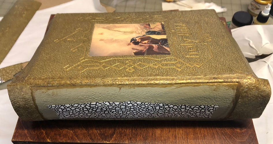
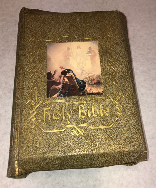
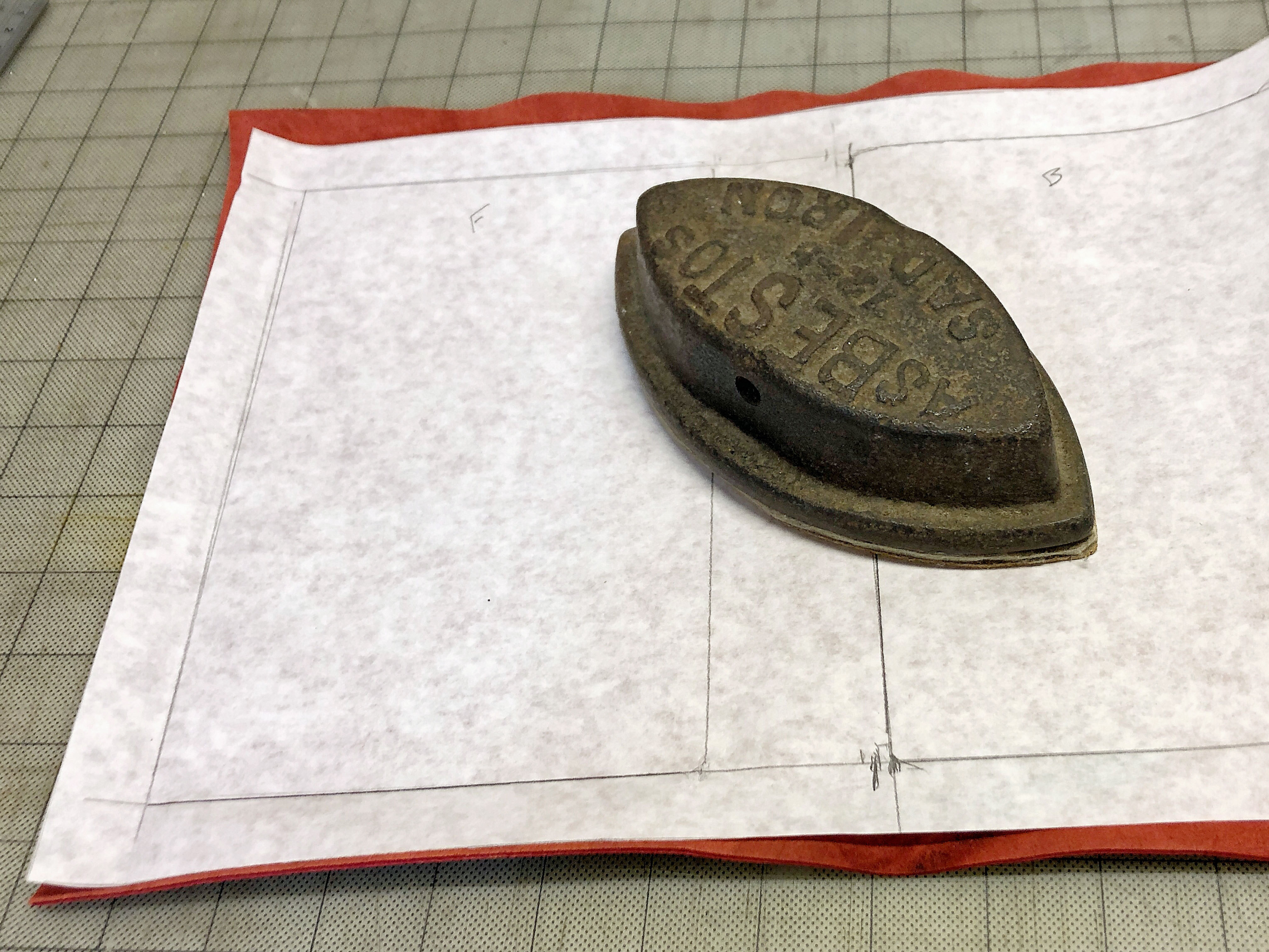
Impossible Bible Repair

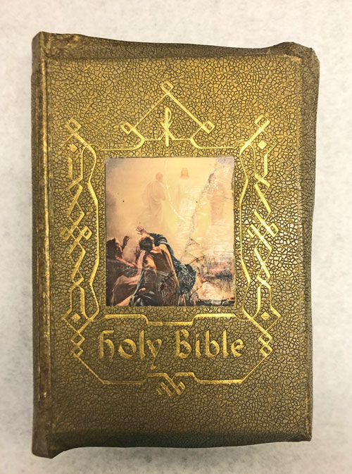
I say “impossible” because ordinarily no sane bookbinder would try to restore or repair one of these bibles. This particular bible edition was made with thick cardboard covers – these become brittle over time. The endcaps break off, the projecting cover edges (called “yapp” edges) break off, the padded covers come apart… and usually the small pieces get lost.
I couldn’t just glue the broken bits back on…it might hold for a few seconds, but as soon as any stress is put on the paper the pieces would come apart. I could have put paper or cloth over the break to hold the pieces together, but that’s unsightly and also liable to tear. Most binders would rebind this type of bible by remove the covers, trimming off the wide margins, making a new cover, then glueing the trimmed pieces back on. Most SANE binders.
But I took this as a personal challenge. The wide yapp edges, the three dimensional textured cover…those were probably why the original owner chose the bible in the first place. The bible has been passed down in the family. I thought about this. The current owner probably remembers the bible the way it was when it was new … maybe the family read from it, or kept it in a place of honor. The current owner didn’t keep it safe it all these years because it was a fancy bible. They kept it because it was their FAMILY bible. I wanted them to be able to look at it and see that original old bible, with all the warm memories associated with it – not look at it and think, “It’s not the same any more.”
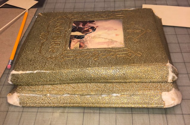
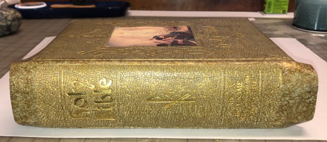
You can see from the initial before/after images that the process went better than I expected. In fact the before and after pictures don’t look radically different. This is what a good restoration is supposed to look like – the repair work is very quiet, and all you see is the book. It’s not easy to do! If you would like to see the “during” photos, keep reading. Click on any image to see a larger view.

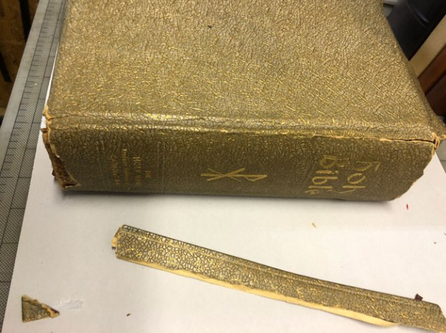


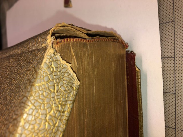

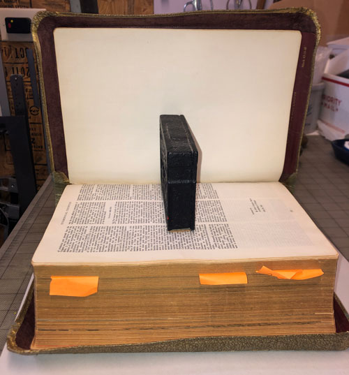
Here’s where we start: the front cover is fully broken at the spine, and the back cover is beginning to separate. The projecting “yapp” edge of the rear cover has broken off, and the front edge is halfway broken from the cover. Both endcaps are missing. I had to carefully remove the entire cover, in pieces, before I could begin the repairs to the pages inside.


Details of the cover construction: There were several layers of tissue paper between the cover cardboard and the printed fabric pastedown. All that held the pastedown to the cover was the fabric around the edge. The cloth pastedown was dry-rotted and torn, so I cut it away from the cover. The endpapers were actually all that was holding the front cover on to the bible. The front cover had the first few pages of bible attached to it, all separated from the main part.


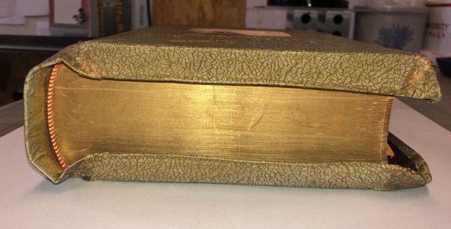
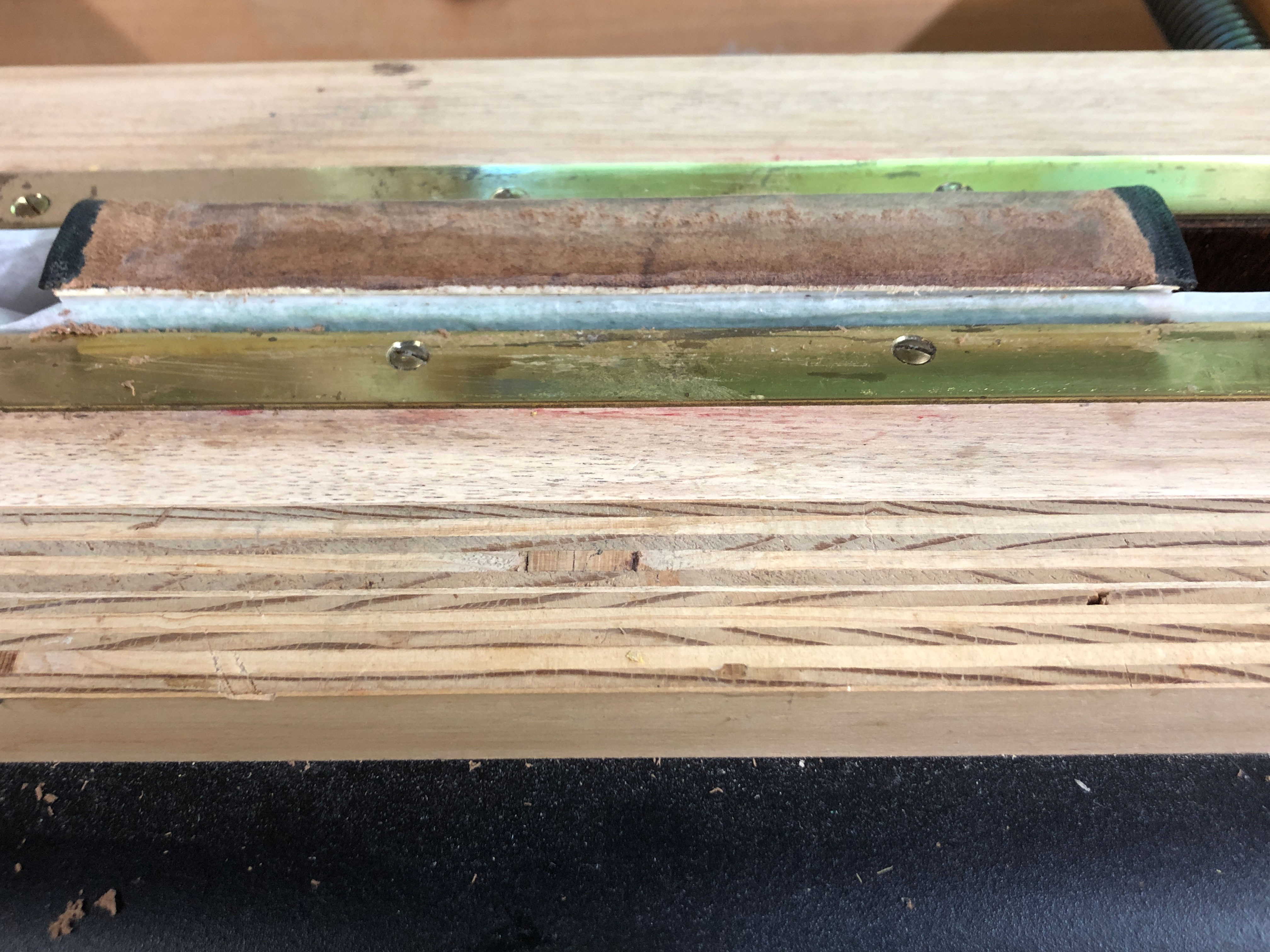
The spine had lost its nice curve and the cloth endbands were torn and dirty. Above at right, the removed endbands on top of the front section. Notice the row of stitching along the spine edge? This first section was sewn separately, stabbed through the side, and then that section attached to the main block of text. It was not well attached.


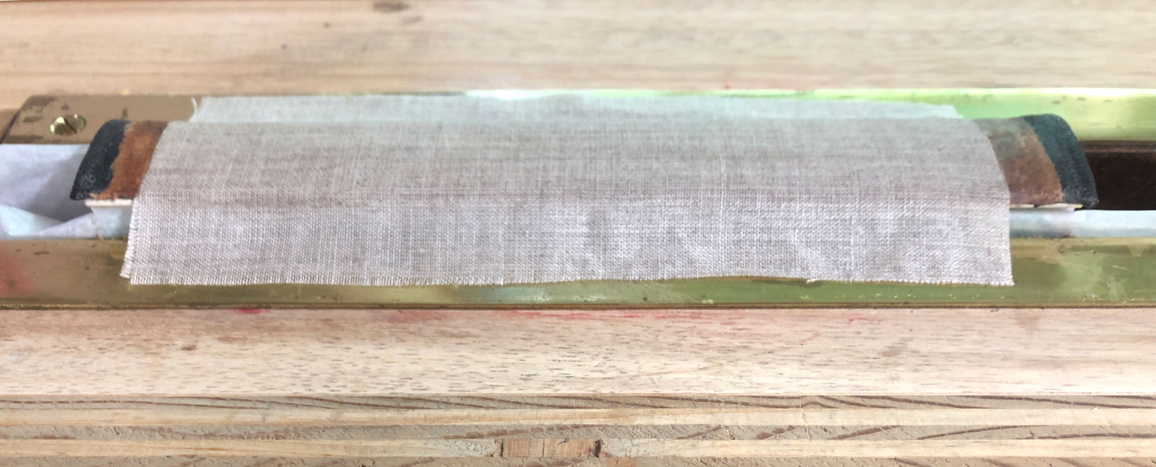
I re-sewed the first few signatures back in place more firmly, sewing through the new cloth, because the existing thread was loose and partially broken. I cleaned the old glue from the spine, reshaped the spine to a nice curve, then re-glued it. The spine was lined with cloth, new replica endbands were attached, and the spine was lined with several layers of paper.
The sins of construction were many. The first inside pages were glued together along the spine, making a very stiff edge that didn’t turn easily to show the title page. The “stab” sewn section made the pages want to come away from the rest of the book in a bunch. The cloth had dry-rotted with age. I fixed the problems as much as I could – I reattached the front section to the title section so it would open nicely, but I couldn’t remove the old glue between the pages. That only comes off with soaking, and soaking would have destroyed the fabric endsheets. There were scads of small paper repairs, guarded joints, new hollow spine, little details that binders know all too well so I don’t need to go into them all here.

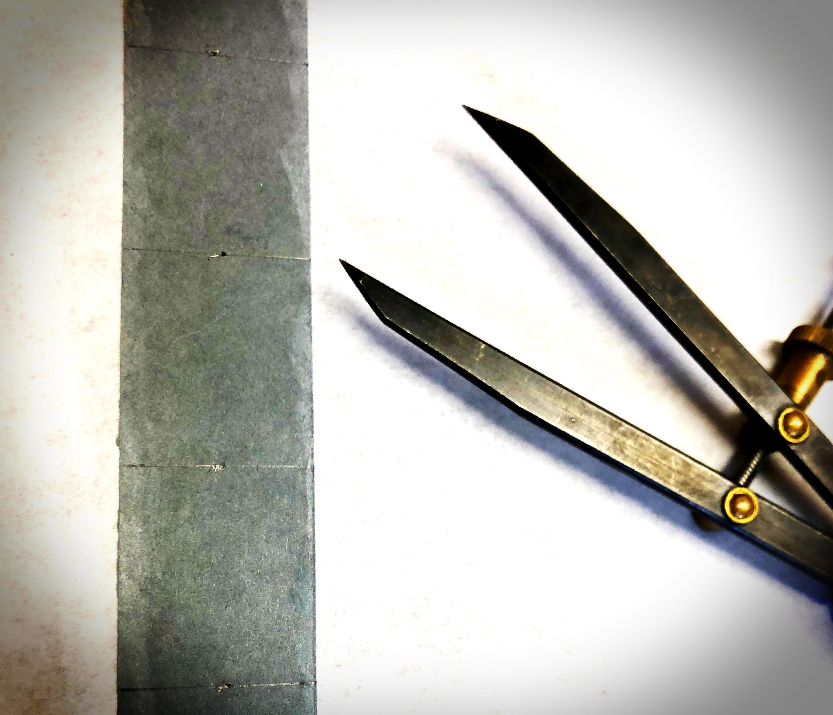
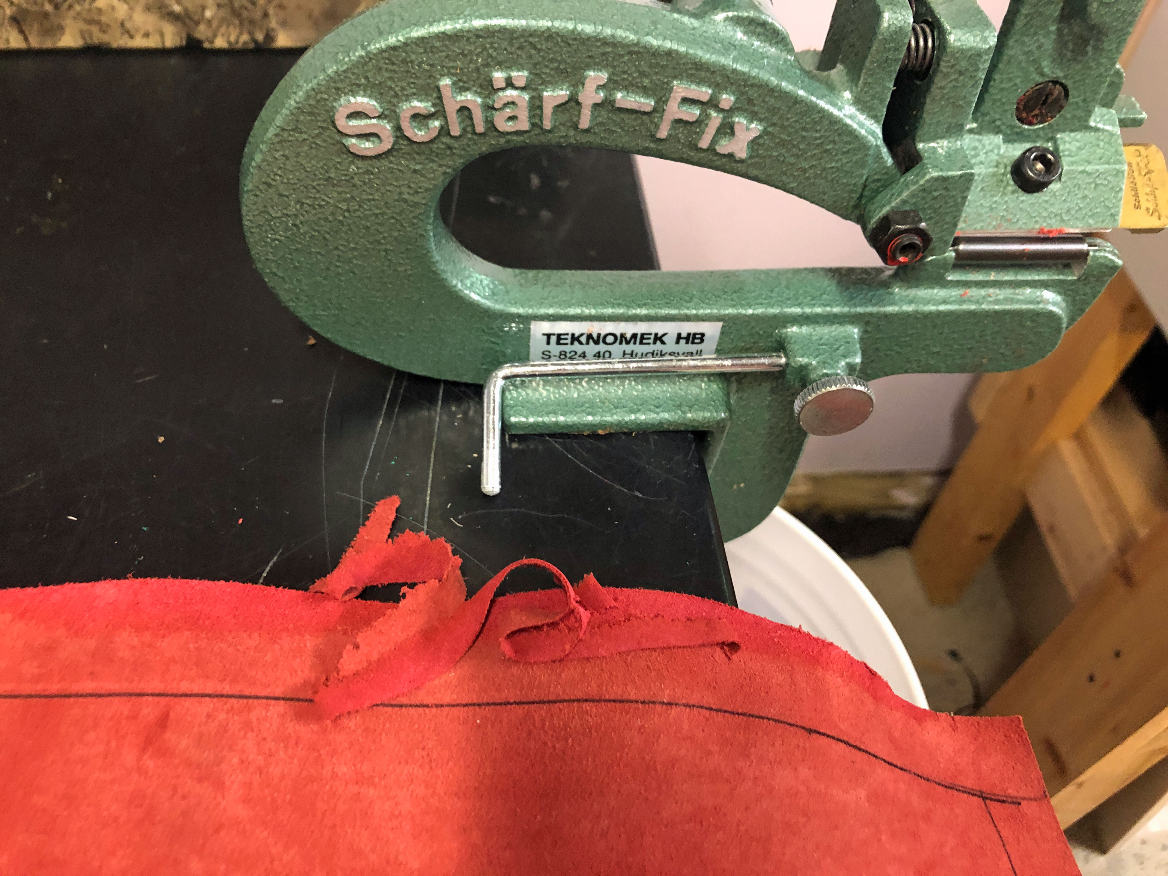
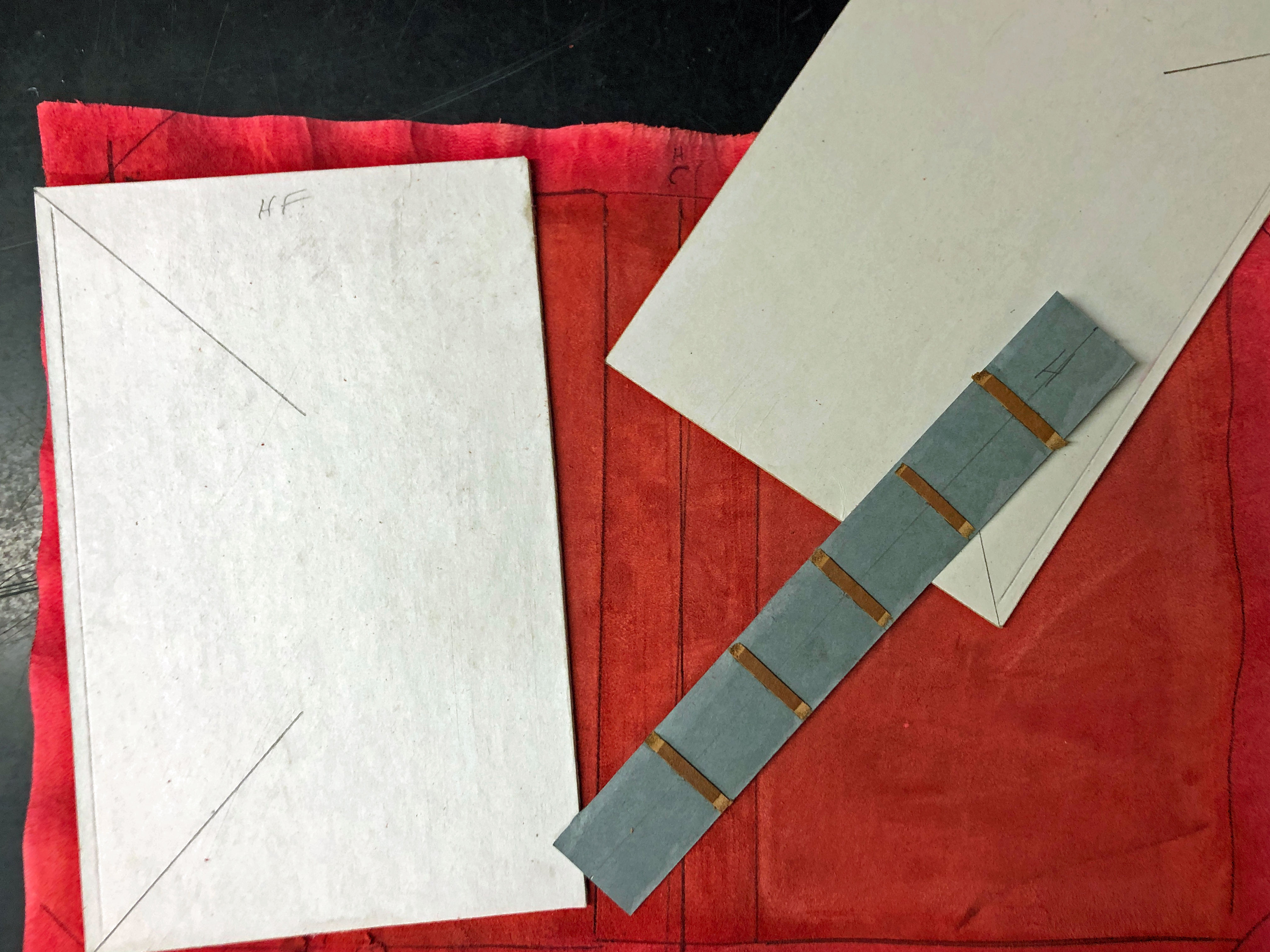
I trimmed the rough edges of the covers and spine, and made a cut-out from thin board to allow me to recess the old spine into the new cover. I pasted several layers of new paper inside the old covers front and back, sort of like making plywood. I alternated the paper’s grain direction between layers to counteract any future tendency to warp. I attached some stiff, thin board paper to provide scaffolding for the rebuilt corners. The new layers of paper made the cover much stronger and held the yapp edges firmly in place.


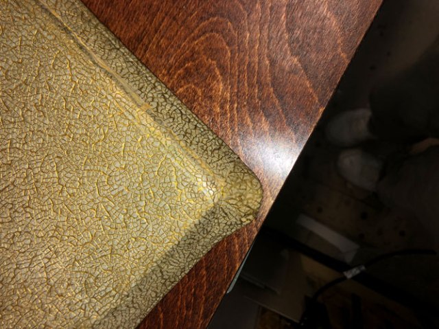
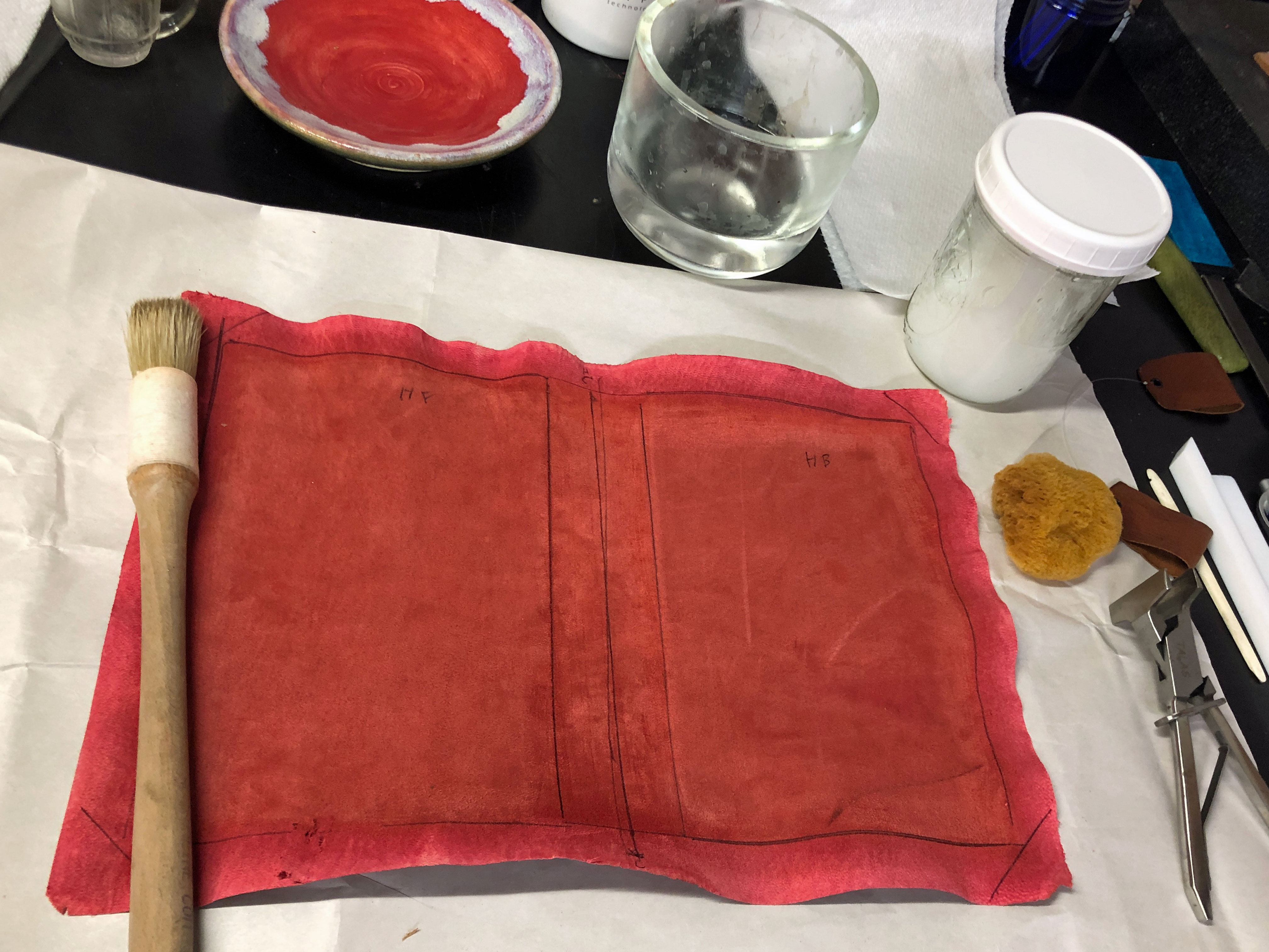
I happened to have piece of textured paper in a three-dimensional broken egg shell pattern. I colored it to match the existing cover color. I colored the lines between the raised paper by hand with a tiny paintbrush.
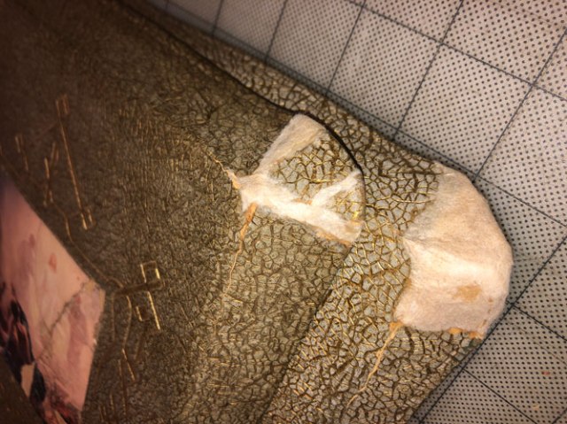
I rebuilt the missing corner pieces on top of the paper scaffolding using special material invented in my bindery – a kind of cross between paper and fiberglass. It is very sturdy, strong, hard, and adheres well to the old cardboard cover. I used it to fill in the gaps where the edge pieces had been reattached. Then I covered the repair with the paper I’d just painted. It blended fairly well.
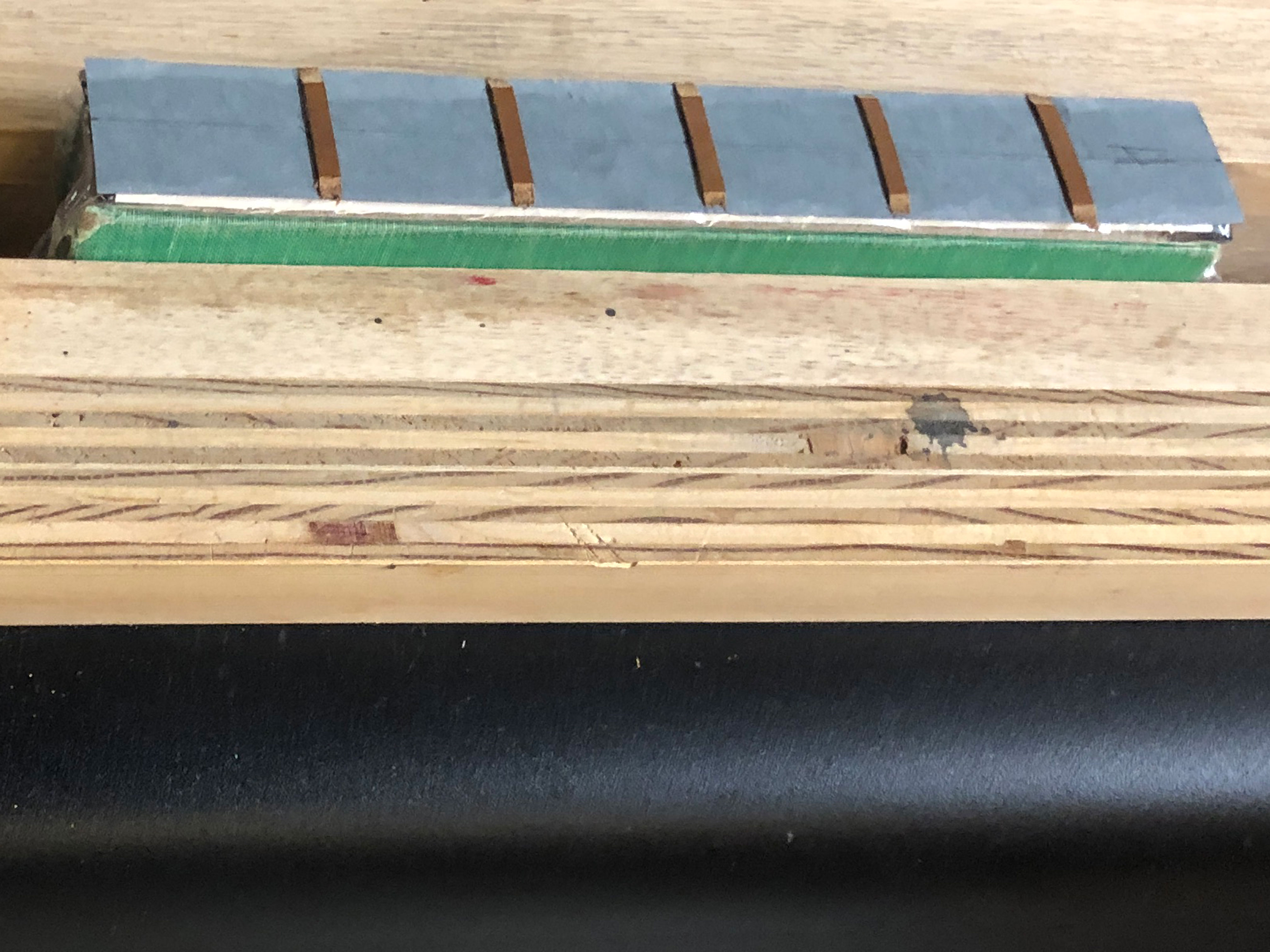
I used strong, thin fabric to create a lining/base for the existing covers. I made a new paper spine ling with endcaps, and attached the cut-out recess to it. I attached the cloth to the inside of the pieces, then use the hand-colored “egg shell” paper to cover the paper lining and the cut edges of the old covers on the outside, turning it in at the top and bottom to cover the inside of the newly formed endcaps. I didn’t paint the whole recess since it would be hidden under the original spine. I decided my original method of painting in the recesses of the paper was too clunky looking, so I painted several more layers of veining and colors onto the repair paper. Then I glued the salvaged spine into the recess on the cover.
I adhered the cover back onto the bible. I touched up the color of the inside of the cover. I glued the printed endsheets back down to the insides of the covers front and back. I lined the edges of the inside covers, where the old fabric had rotted, with handmade Japanese tissue. I salvaged the old cloth edges with the printed captions and attached them on top of this tissue.
Once I was happy with the structural repairs, I primped and fussed and adjusted the colors and generally tried to get the repair as perfect as I could. I noticed that the small printed image on the front cover had a protective plastic layer that was delaminating and that some of the image was missing. I painted in the missing parts of the image, and put a layer of protective acrylic over all.


All in all, the restoration of this bible took over 20 hours. For this reason alone, most SANE bookbinders don’t undertake this type of restoration. I am well satisfied with how it came out.


Bookbinding for fun and profit
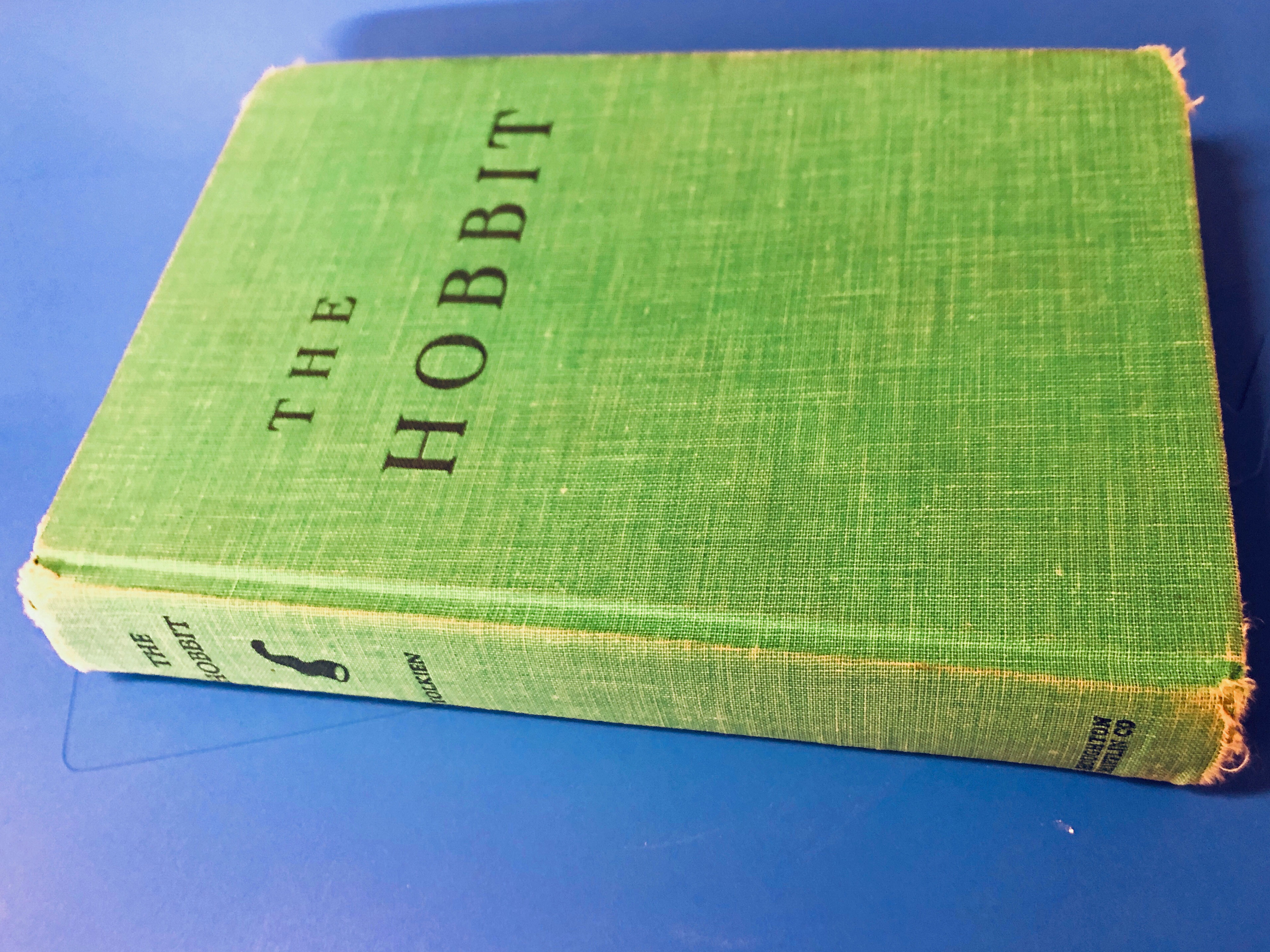
A friend mentioned that he’d like to see what I would do with a copy of “The Hobbit” by Tolkien. I wondered about that myself. Here’s what I did.
First, found a hardcover copy of the book that was sewn, not glued. This was an ex-library book with a lot of use that was still in good condition.
Next I removed the old cover, keeping it handy to protect the text block during rebinding.

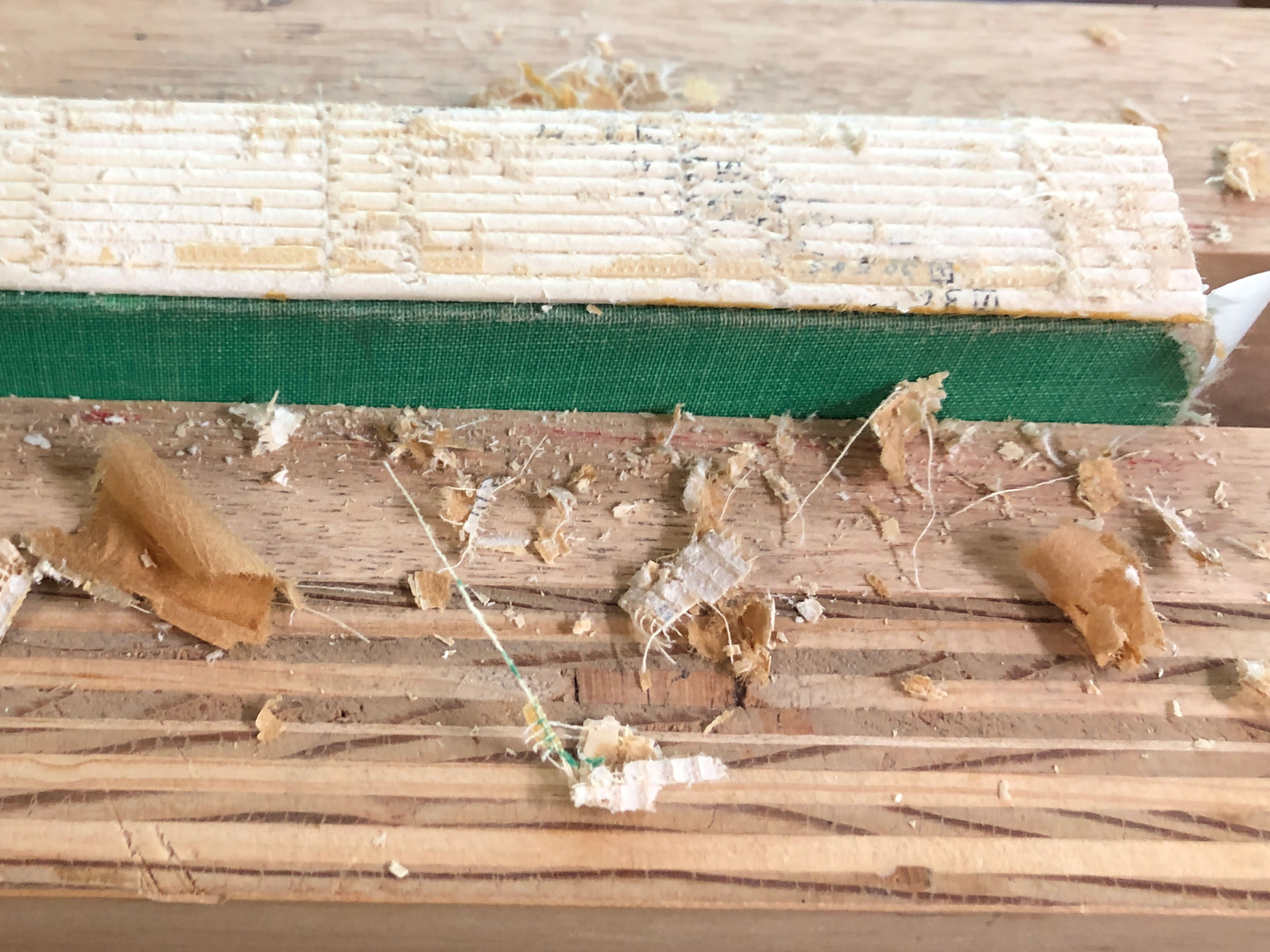
Then I chucked the book in the job backer to clean the old paper and glue off the spine.
Then I made the final decisions about leather and endpapers. Made flexi-fold endpapers. A typical book has a “stiff leaf” – the colored endsheet is pasted to the first white sheet. When this page is turned, it tends to lift the next white endsheet with it. A “flexi-fold” endsheet has the colored sheet pasted to the first white endsheet just along the outside edge, which makes the page much more flexible. It shouldn’t lift the next page when turned.

After cleaning and reshaping the spine, I reglued it, decorated the book edges, attached leather endbands, then lined spine with suede and sanded that smooth.
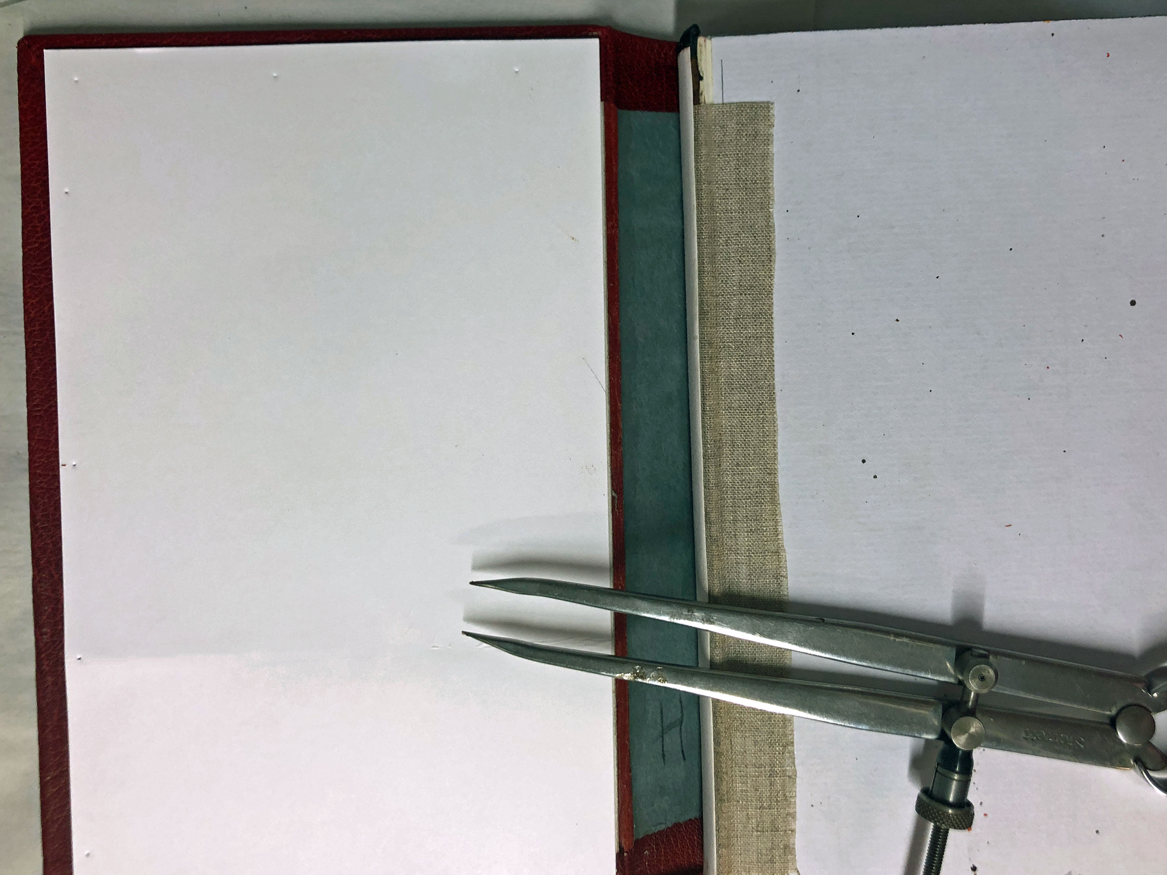
Then added a strip of linen to aid it attaching the new cover.
On top of the linen I glued a German hollow tube.

Marked up a spine lining strip for false raised bands.
Double-check the fit of the spine strip with false leather bands attached.
I made a pattern for the leather cover.
Transferred the pattern from the paper to the leather.
![]()
Pared the edges and turn-ins.
Refreshed the pattern after paring.

Assembled all the materials for the cover: leather, spine strip, and new cover boards. I didn’t take pictures of the tedious chamfering of the boards of lining them with paper on both sides.
All ready to go with fresh paste, new scalpel blade, and assorted folders/triangles/straightedges/sponge/water/paste brush/band nippers…
After pasting the leather to the new cover boards and forming it around the raised bands on the spine strip, I let the cover dry on the (plastic-wrapped) text block so that it would have the correct shape. Once it was fully dry, I marked the inside turn-ins and filler card using dividers to make small marks. Cutting through paper and leather at the same time gives an exact fit for the liner card. The liner card is the same thickness as the leather turn-in, so it makes a smooth surface for the decorative paper.
Once everything is dried, I attached the new cover to the book, gluing the spine to the hollow and attaching the linen strips to the inside covers. I trimmed them back close to the inside edges of the covers so they wouldn’t make a big lump under the pastedowns. Once that was all dry I pasted down the inside pastedowns, trimmed the new endsheets as needed, and finished the flexi-fold endsheets.
I thought a long time about decorating the cover, but none of my efforts were satisfactory. I had printed the spine text using genuine gold foil on the Kwik-Print before attaching the cover. Finally I made an inlay to look like the door at Bag End. I used a bone folder to create boards and wood grain on green leather, then set that into a piece of fair calf, then applied very thin bits of brown leather on top of that for the brickwork/stonework that surrounds the door. Colored the leather to bring out the “woodgrain” and to give the stones some shading, then inlaid that into the cover. Ask me if it’s nerve-wracking to cut a big hole in a perfectly good leather cover. OK, since you asked … it is.
Here’s the final book.

Detail of inlay.

View of top edge showing leather endband and colors spattered over a graphite base color.

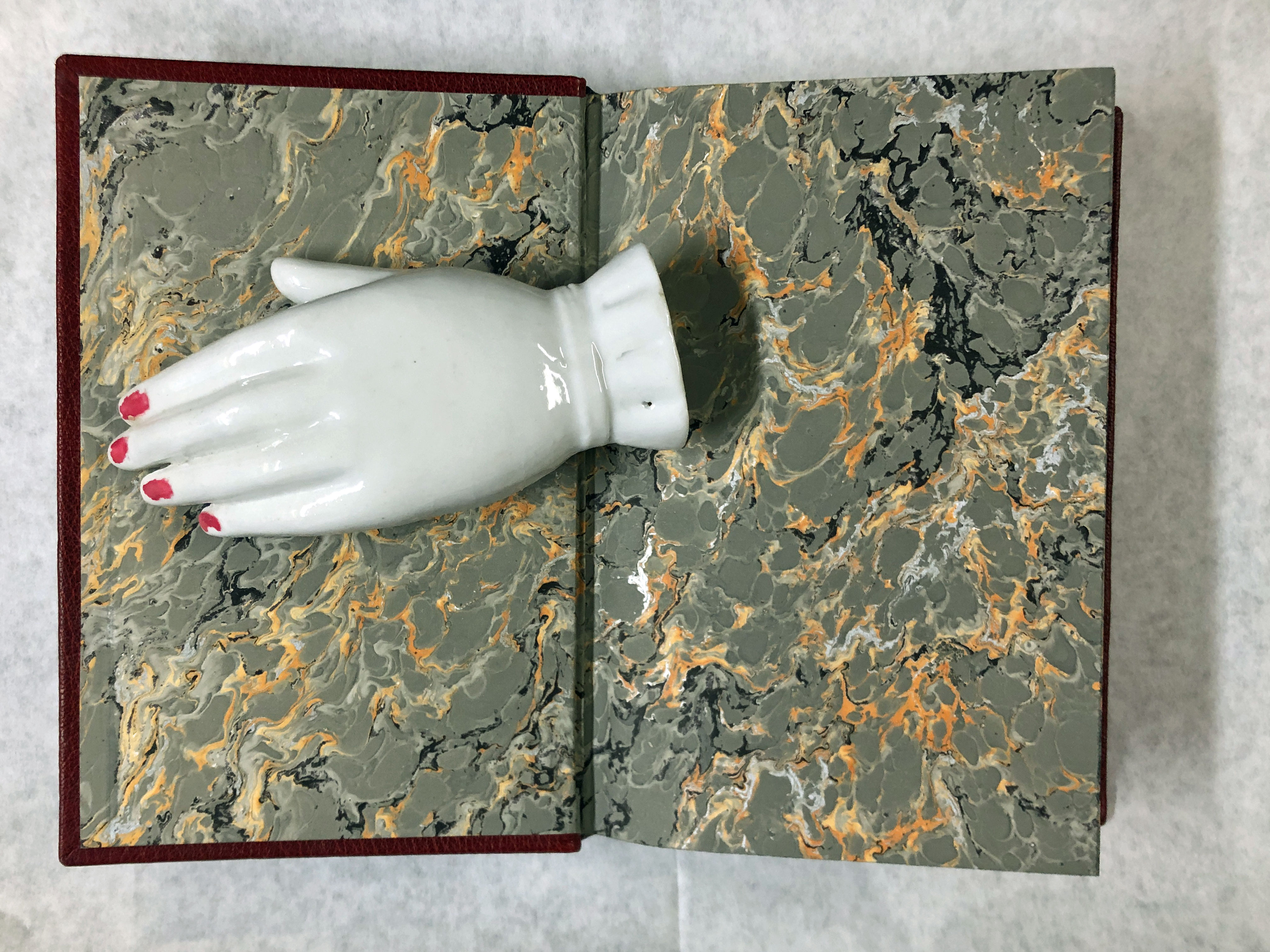
Here is the inside cover…
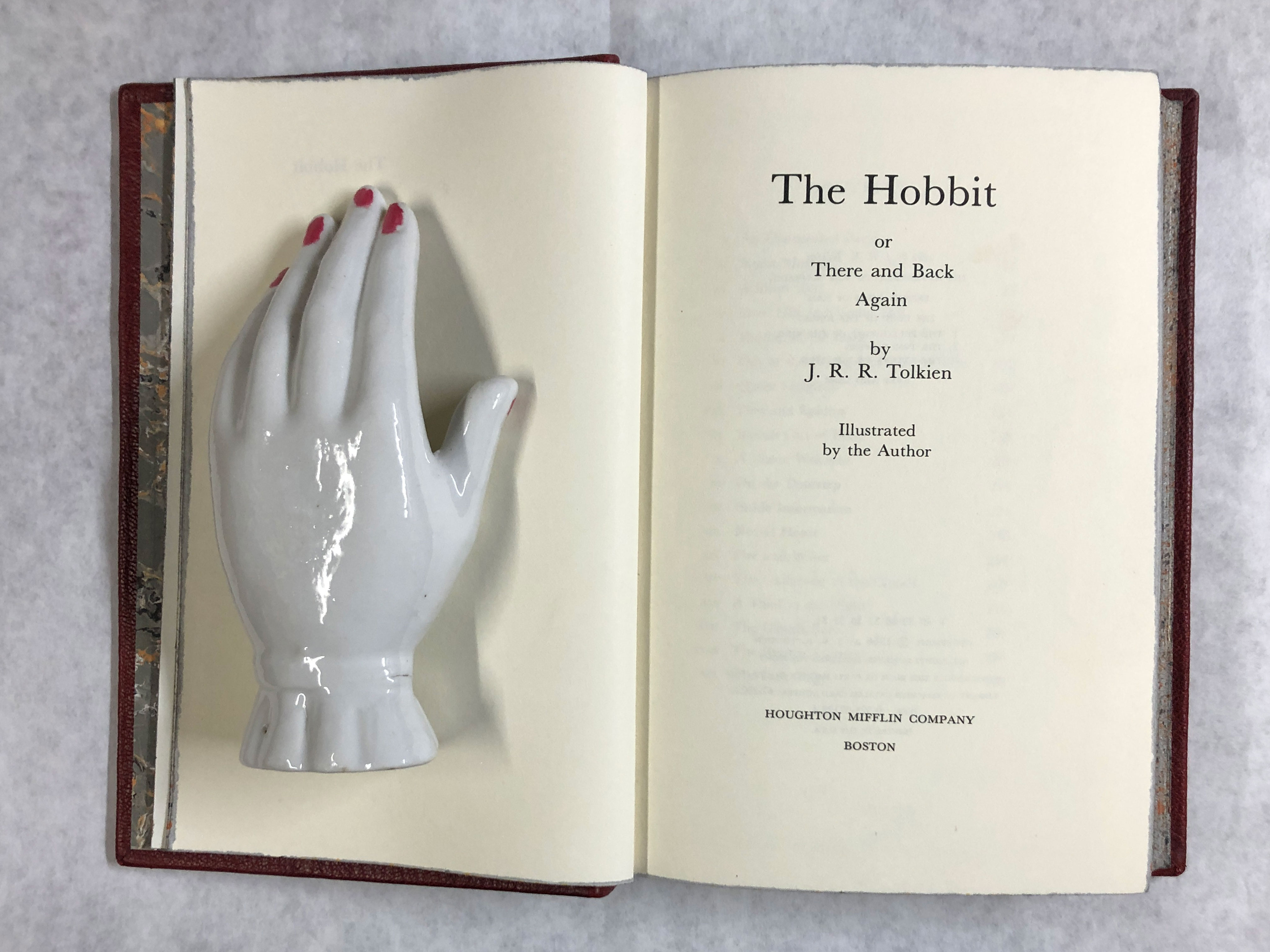
Small title page.

Title page.
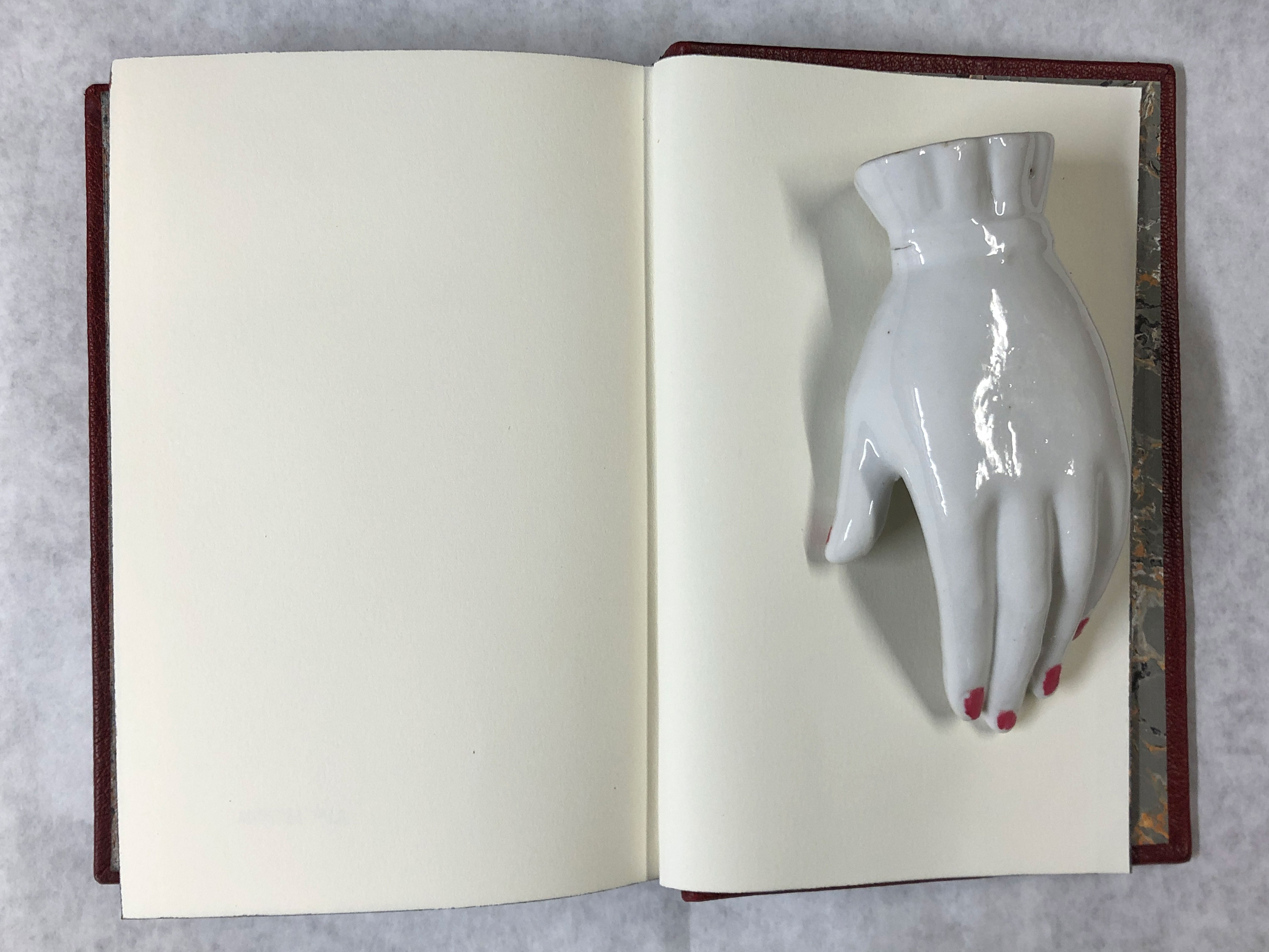
Back endsheet.
And outside back cover.
The leather’s not actually that mottled … I had shadows on the photo. I gave the book some final primping, trimming, protective leather treatment, and sent it off in the mail.
This was a fun project and just what I needed to get back into design binding. I wonder what will be next….

Bookcloth: Interlaken Art Buckram
For those of you who just joined us, this is one of a series of posts about vintage bookcloth samples. Continue reading to see all of the pictures of bookcloth in this booklet.
Yet more books about books. Can you blow your Horn book?

History of the Horn Book, by Tuer, 1979, reprint of the 1897 original. Cloth hardcover with dust jacket. Bookplate but otherwise most decent. Originally a horn book was a printed sheet affixed to a wooden back and covered with a thin sheet of horn – thin enough to read through – which protected the page from the Grubby and Destructive hands of Children. With time, many began to refer to any child’s ABC book or primer as a horn book. Once there were millions of the genuine article, horn and all, but now they are scarce. The passenger pigeon of books? If they were so rare in 1897, what are they now? Have more been discovered? The author of this book knew of so few copies that each almost has its own biography. Just the kind of specialized, obscure reference book that so delights.
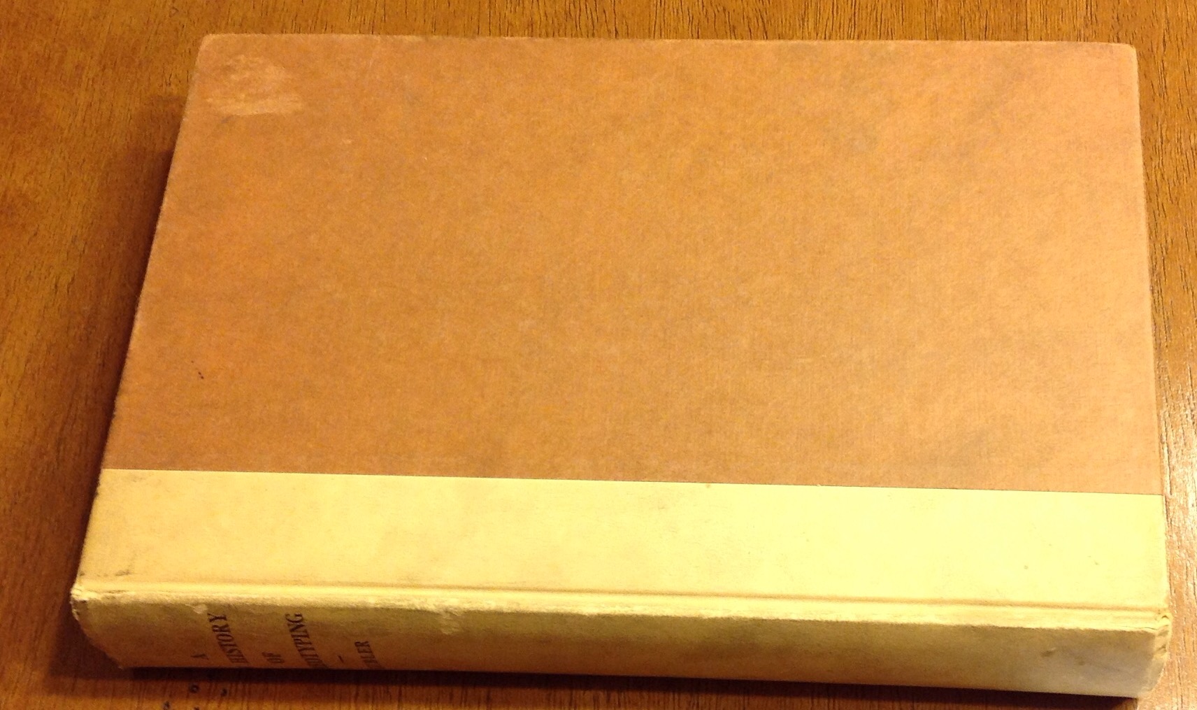
A New History Of Stereotyping, Kubler, 1941. Hardcover. Another fairly comprehensive book about printing history. In good condition. A secret surprise inside: a loose sheet of blue paper on the letterhead of the Certidied Dry Mat Corporation in New York, which ends with “Please grant me the pleasure of accepting this volume, together with my heartiest good wishes. Yours respectfully, George Kubler” with what I assume is a printed signature. Lots of history, lots of photographs, lots of drawings. This book is notable for the amount of space and illustrations devoted to would-be replacements of stereotype machines which the author scornfully derides. Since many of these machines never made it into commercial use, they may not be as well documented in other History Of Stereotyping books I have seen. Entertaining!

The Life Of The Book, by Lehmann–Haupt, 1957. Cloth hardcover with dust jacket. Nice condition. “How the book is written, published, printed, sold, and read.” Doesn’t seem to include “made into a cute end table by some yahoo with a glue gun.” Don’t get me started. I’m an old curmudgeon who likes books as books, and I hate to see pretty old books made into handbags when they could have been in my library. Wait, I have too many books already. Well, après moi le deluge, right? This small book is a gem. Some history and some advice on getting published and on collecting. I can’t let this go without a lengthy but marvelous quotation. ” The interesting and important thing about the public library in America is that it offers free reading facilities and a great number of varied services to every member of the community, young or old, rich or poor, regardless of race, color, or creed. Its doors are open to the highly educated as well as to the average reader, to the citizen and the immigrant, to persons in search of practical or special information as well as to those who wish to broaden their education generally and enrich their minds. The public library is host to the person who wishes to while away an idle hour as well as to the professional author and the scholar. Every day many thousands of people in the United States use their public library without ever realizing how privileged they are in comparison with the citizens of many other countries.” Can I get an amen? Maybe I can’t let this one go…I owe all that I am to a library and to librarians and this little volume is a beautiful love poem to the book.
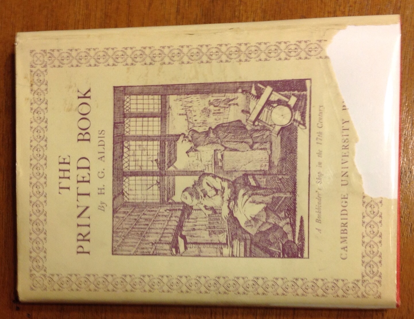
The Printed Book by H.G. Aldis, 1929. Small cloth hardcover with dust jacket. Bookplate, torn jacket. Lovely little thing with history, illustrations, and admonitions. Lots of pith in a small space.

The Art of The Book, by Ede, 1951. Cloth hardcover with dust jacket. “Fifty separate contributions by authorities from various countries …headings Type Design and Lettering, Printing the Text, Illustration and Graphic Reproduction (Including Dust Jackets), Commercial Binding, and Hand Binding.” Many great illustrations in a largish book, including whole page reproductions and gorgeous as-in-Gaw-Jess fine leather bindings. Like Itchikoo Park, it’s all too beautiful.
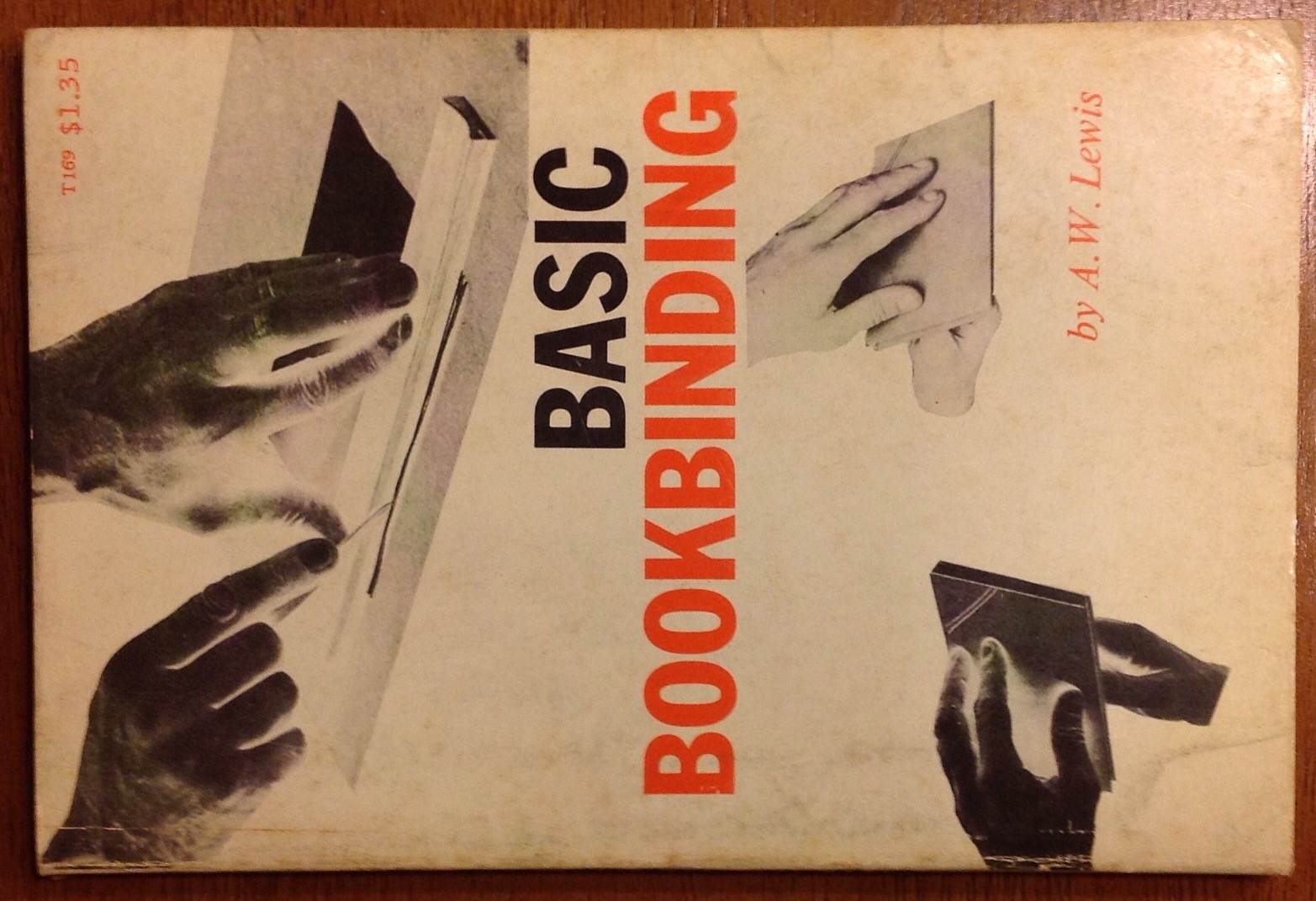
Basic Bookbinding, by Lewis, 1957. Sewn paperback binding. Surprisingly detailed descriptions and illustrations of tools and techniques for the novice, but even the experienced binder might learn something new. For me, it was the trick for positioning large pasted sheets exactly. If you have to start somewhere, you could do worse.
Some more books about books. Mostly history of books and printing.

The Book, by Douglas McMurtrie, 1989. Hardcover with dust jacket, no markings, very nice. A history of bookmaking and printing. Starts way back in the dawn of literate time and works its way up into the present. THIS IS A BIG BOOK WITH NICE BIG PRINT. I mean, not huge, but you shouldn’t need the cheaters for this one. Lots of illustrations and informative digressions. Very complete, very well written, very useful.
Books and Their Makers in the Middle Ages, Putnam, 1896. Cloth hardcover, fading to cover but amazingly good for the age. Clean pages inside with a few pencil marks on the front flyleaf, but some dirt on the fore-edge deckle. Very thorough treatment of what the title says. Not so much a how-to book as a how-it-was book and sometimes that’s what you need.
The Golden Book, Douglas McMurtrie, 1934. Pages slightly yellowed but not brittle or dirty. The origin of the alphabet! The invention of printing! A typographical messiah! Techniques and the art of bookmaking. Sorry, I’m getting punchy. It’s really quite the serious and detailed tome, full of nearly forgotten lore and a fascinating read.
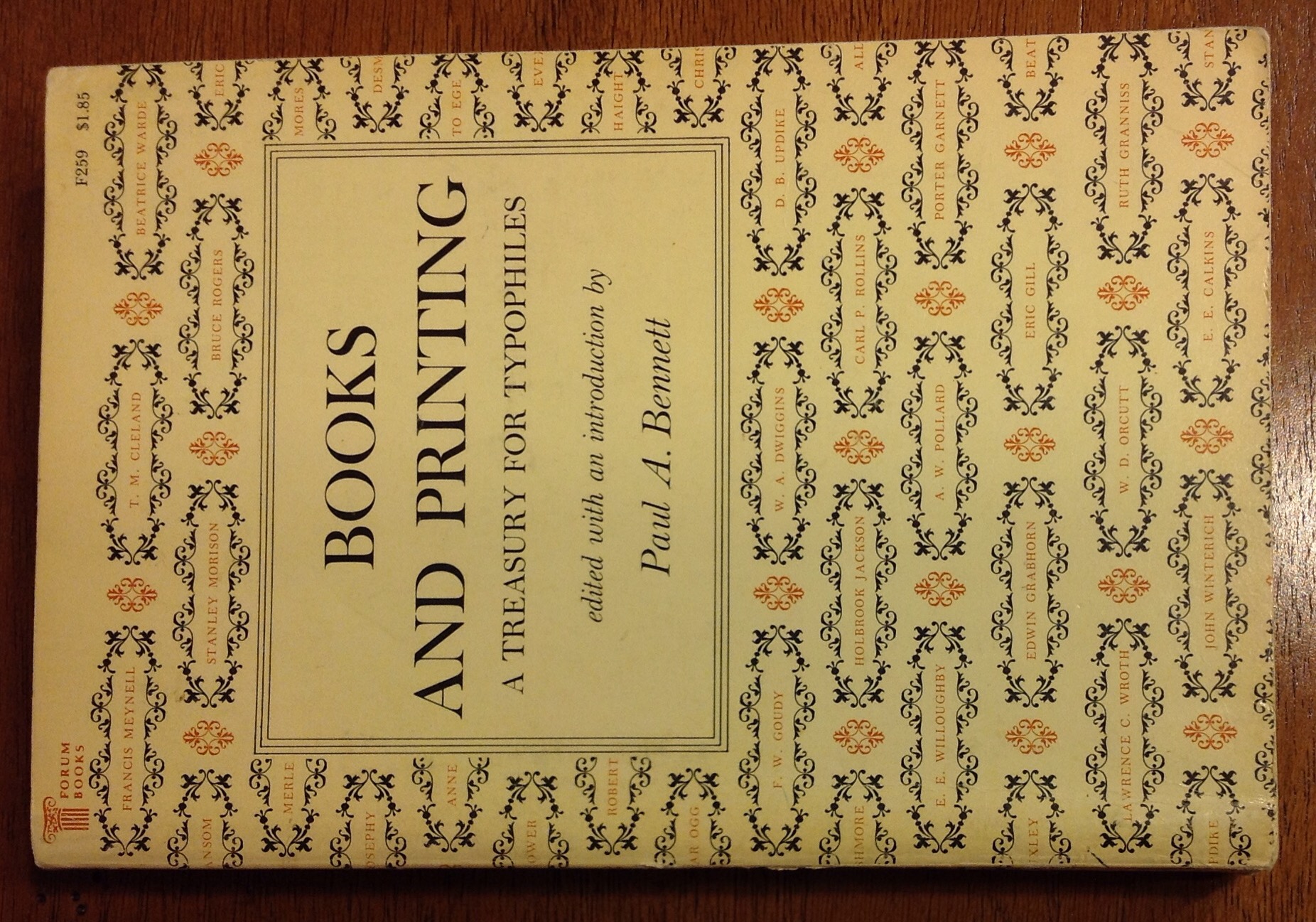
Books and Printing, a Treasury for Typophiles, by Bennett, 1963. Paperback, perfect bound. A collection of essays and articles about design, about type, about printing, about the reason for the curious arrangement of type trays…the variety of authors gives a refreshing variety to the reading, with more serious and scholarly articles alongside sea stories from grizzled printers and hand binders. There’s something for every print lover in this book.
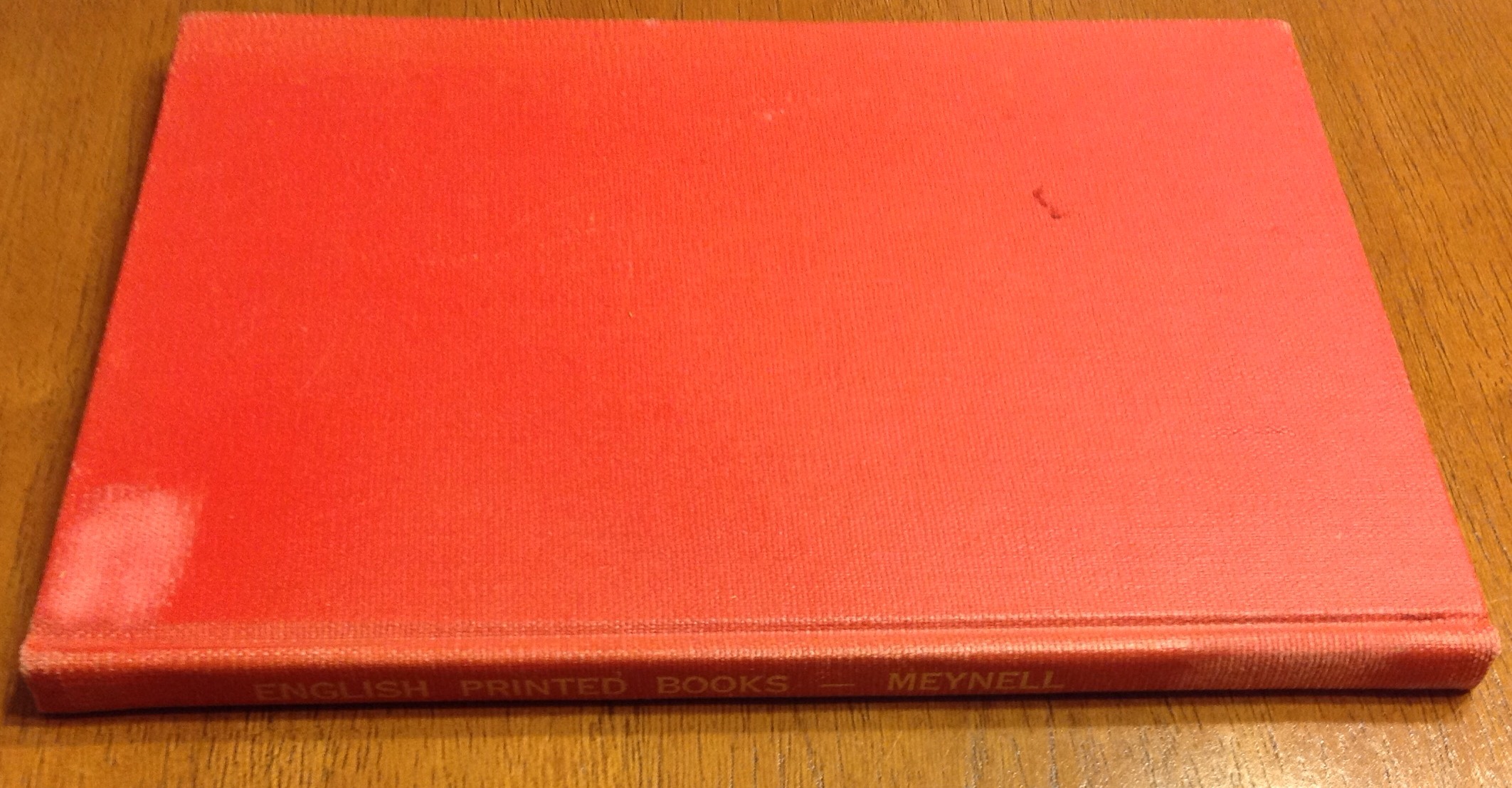
English Printed Books by Meynell, 1948. Cloth hardcover, ex library book. Not just books printed in English, this is mostly books printed in England. A slender, elegant volume packed full of color and b/w illustrations. Some history of printing, illustration, design, type…many subjects for a small book and absolutely fascinating.
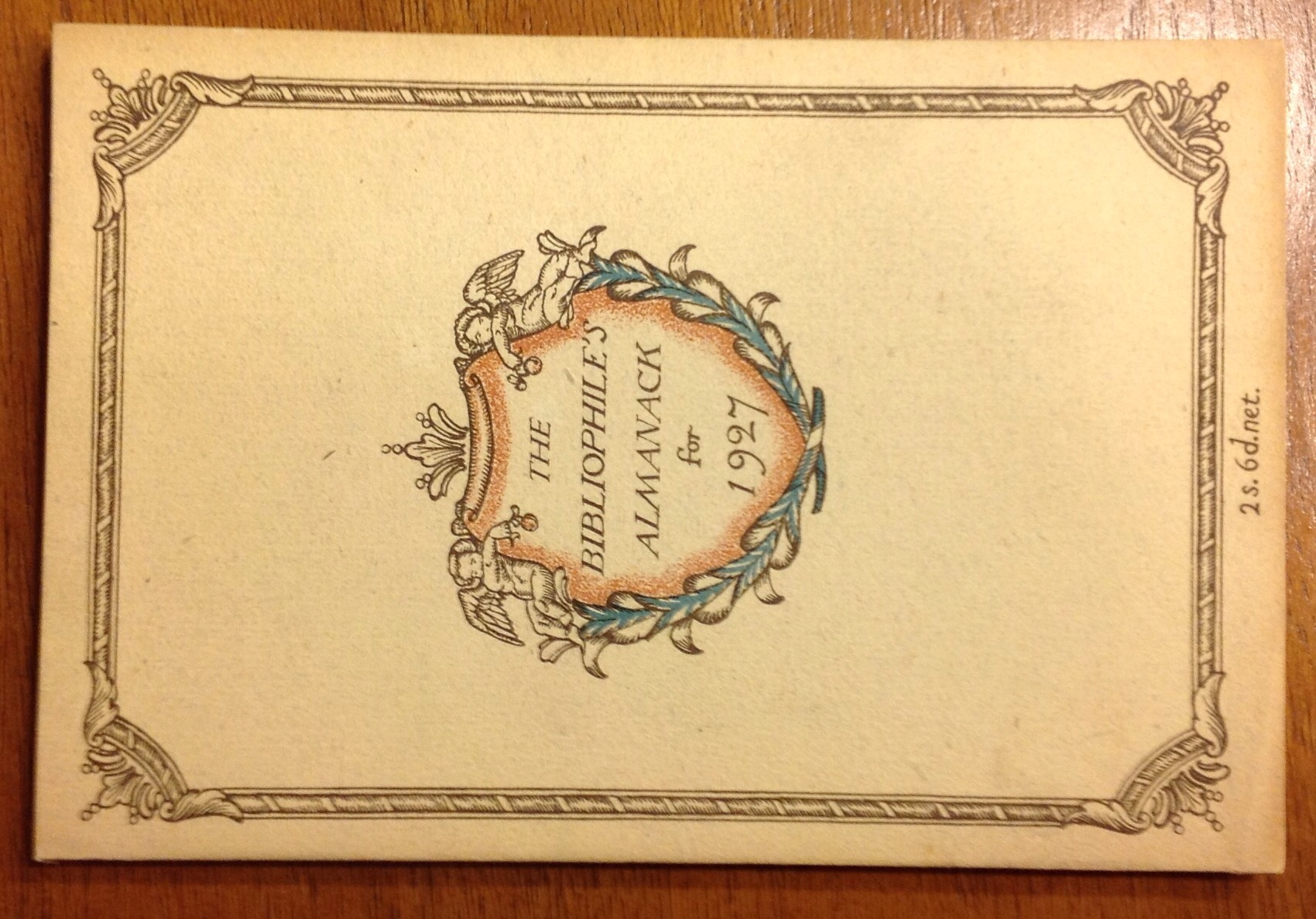
The Bibliophile’s Almanack for 1927, sewn paperback, Simon & Child, 1927. A small book that doesn’t look its age. Starts with a 1927 calendar, essays, book reviews, artwork, lots of tidbits for book lovers. Sample? OK. ” …the perils of the young bibliophile are numerous: they lurk in the bookseller’s pleasant groves as well as on the street which is called Farringdon, and as tempting drabs in the Caladonian Market. Yes, my elderly aunt would have been relieved ….that her nephew had at least fallen in love with a minor classic when he might have formed an unfavourable attachment for an early Bradshaw, become ensnared with the less desirable of the Erotica, or, more romantically, conceived a passion for some unattainable scion of the Incubabula.” Its like “as the page turns” or “all my volumes” – a bookbinding soap opera. Health life in the library. In my secret heart I, too, burn for the unattainable Incunabulus …
Some books about actual art in bookbinding
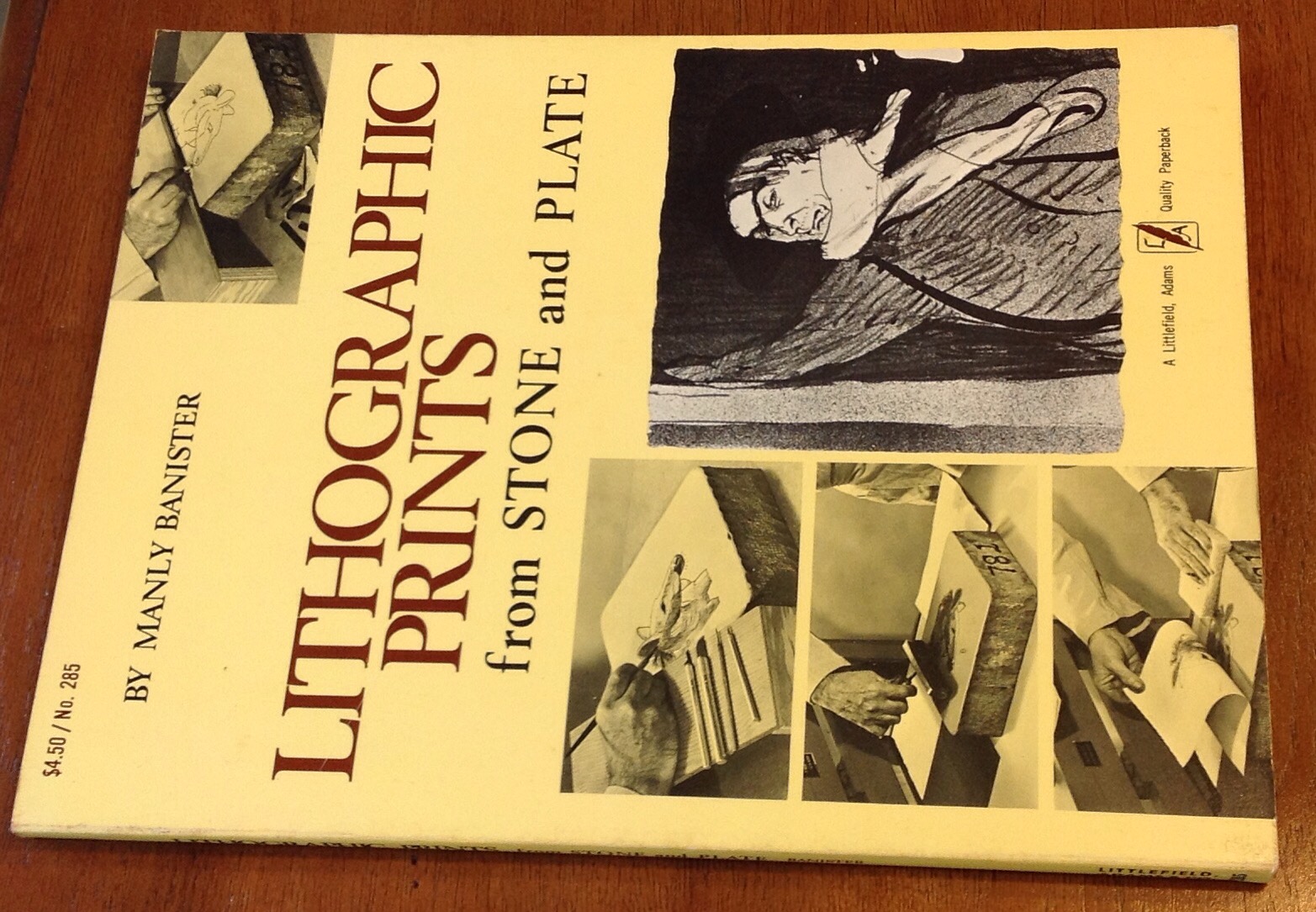
Lithographic Prints from Stone and Plate by Manly Banister, 1974.
Paperback, good condition. For the rank beginner at lithography, telling you everything you need to know except for where to get the darn litho stones. I’ve been looking for years for a larger stone. Lots and lots of detail and photographs showing every step including how to flatten a stone, how to build the wood stand, arrange the print shop, I mean everything. I don’t dare read any further or I’ll be tempted to take up the art, and we’ve already established that I don’t have the stones for it.
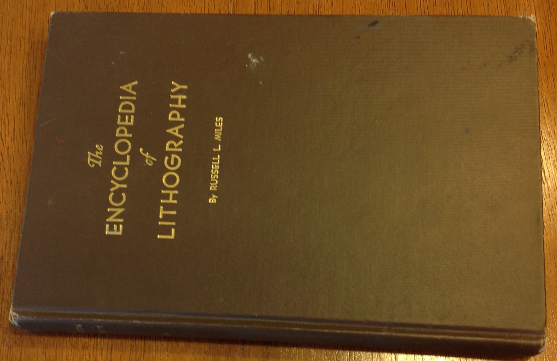
The Encyclopedia of Lithography by Miles, 1938. Brown cloth hardcover with an owner’s name inscribed in pencil inside. Otherwise clean and tight. A most encyclopedic work and perhaps you will be entertained by some excerpts. I am. “No other graphic industry for instance has presses that will use completely planographic plates, that use water fountains, that use an offsetting cylinder or that use a stone as the reproducing medium. Neither do other graphic processes use a colloidal phenomena to achieve their printing plates.” Well, duh. Long reprint of a technical paper The Theory of Three Color Reproduction with way more graphs, charts and equations than you the artist probably want, and all in glorious black and white. What’s wrong with this picture? Redeems itself with wonderful entry under Letter Construction which includes ” … The H goes to the uttermost extremes a letter can occupy in space, and every letter with which it is associated with must conform to it in size or the area it occupies in order to get uniformity of quantity. Even the W and the M have to be whipped into line if the Orthodox idea of excellence is the criteria, though both of these letters are much wider than the H.” Such stern threats against poor W and M. Is this why they have to stand on the doors of public toilets everywhere? are they being punished for some sort of insubordinate width?
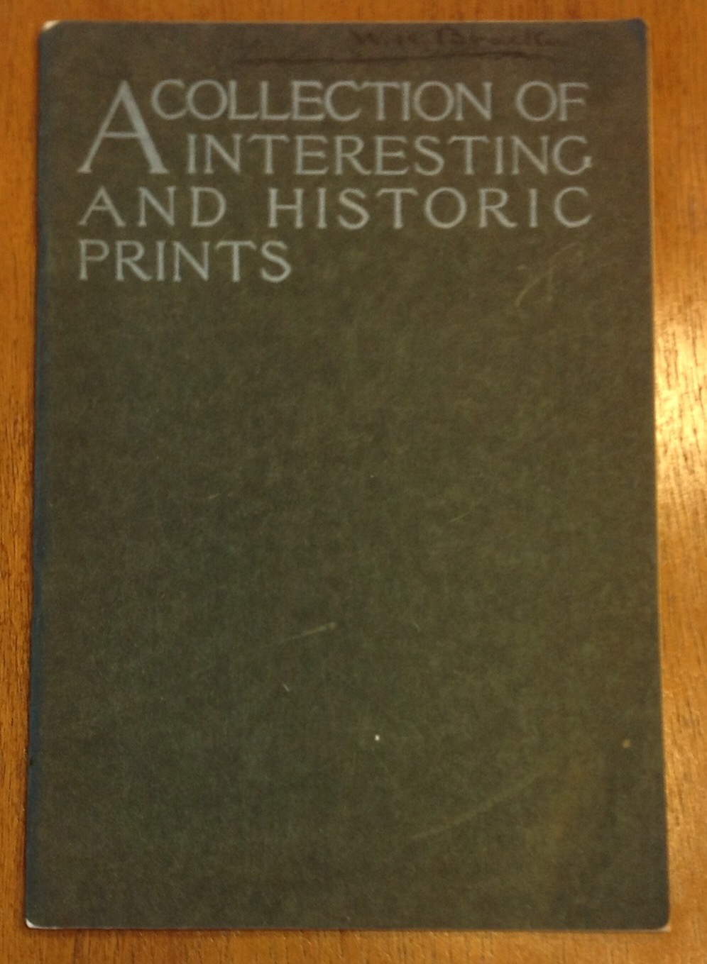
A Collection of Interesting And Historic Prints, 1909, State Street Trust Company. Being a single section paper covered book of …. Here, let them explain it: “The State Street Trust Company takes this means of presenting to you its compliments. It hopes this booklet of historic prints will be of interest to you. All of the reproductions are taken from copies or originals in the possession of this company, which are to be seen at its main office, 38 State Street. Many of them to depict some interesting phase of Boston’s history. Please consider this booklet also as an invitation for you to inspect the prints from which these reproductions have been made.” I think they are just trying to get you into the bank so they can talk you into opening a Christmas club account. If you go, check and see if all the pictures are still there. I bet some of them have been smuggled home over the years along with other office supplies. It is a nice collection of historical prints. I’m particularly fond of one described thusly: celebration incident to the introduction of Cochituate water into Boston in 1848, and first exhibition play of the fountain in the frog pond on the Common. In left foreground, with a dog behind him, is Daniel Webster.” It’s quite the gathering of the masses. I didn’t see any port-o-lets in the etching … Perhaps some advantages accrue to wearers of hoop skirts, after all.

Prints And Books, Ivins, 1926. Cloth spine over paper hardcover, Newberry Library bookplate in front, not stamped discarded so there may be some overdue fines. A little dirty, front joint is contemplating loosening up, but good condition. May I quote? “The following …papers were written because the writer, in the course of his work, became so enthusiastic about certain things that he wanted other people to be interested in them, too.” Written for the regular non scientific reader who would like to learn about prints and books and maybe look at some nice illustrations. Utterly fascinating, srsly.

The Illustration of Books, by David Bland, 1951. Pretty yellow cloth hardcover with dust jacket. A history of book illustrations with black and white and color images, discussion of processes and techniques. I just read the section on William Morris, and I can only sigh with delight. A wonderful book.
A New Leaf

three things on my wall
mean nothing to others
but I remember
