Barnaby, the Prequel

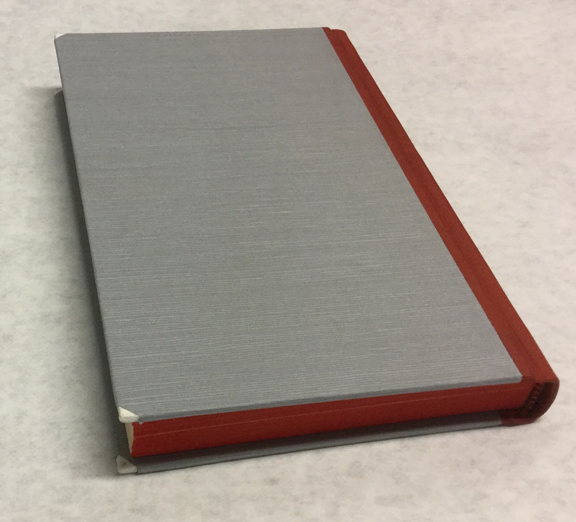
I found the “before” pictures of Barnaby. Here they are.
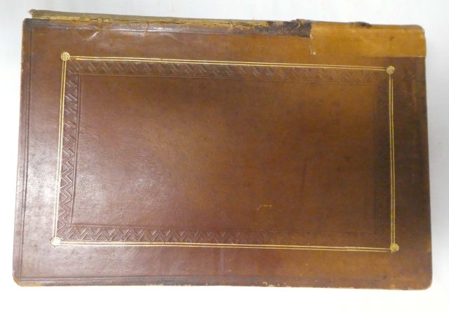
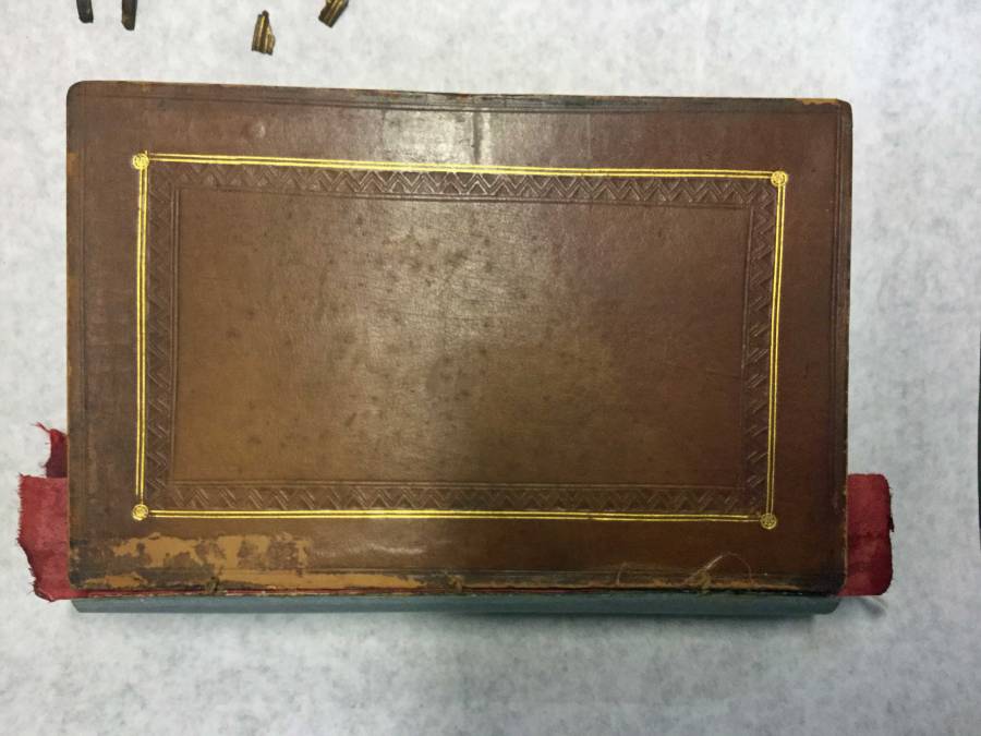
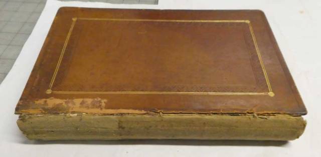
Barnaby_A

Front Cover

Barnaby_B

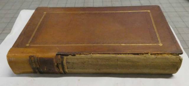
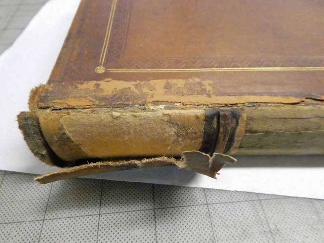
Front cover, showing the remnants of late repair. Looking at this, I assume this repair leather was inserted underneath the original spine. It worked for a while, and then the rest of the original spine was lost.

Barnaby_C

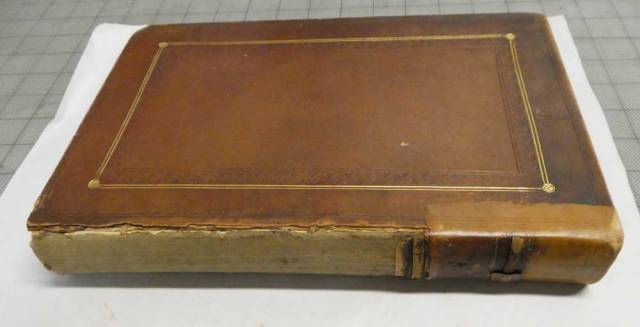
Back of book, showing repair attached. Notice how the repair leather is pasted on TOP of the original boards, and only goes part way down. That’s probably because at the time that repair was made, part of the original spine was still attached. And normally the repair leather would have been put UNDER the cover leather, not on top of it.

Barnaby_D

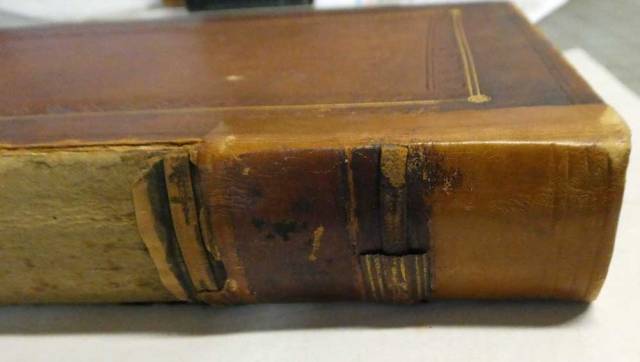
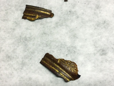
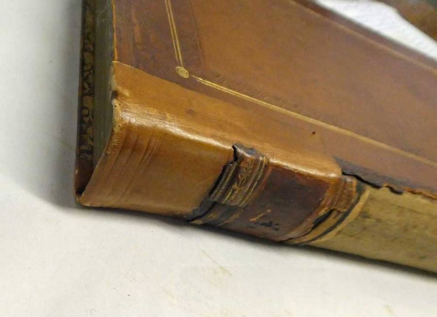
Close up of the repair. If you look closely, you can see a piece of gold-tooled leather on top of the plain leather. I think this is a remnant of the original spine.

Barnaby_E

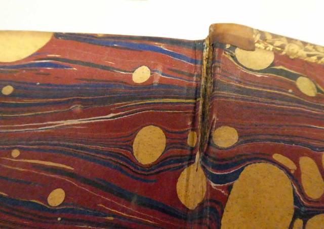
You can see how the repairer turned the leather in at the top. Part of the leather is dark – was the old label pasted on here?

Barnaby_F

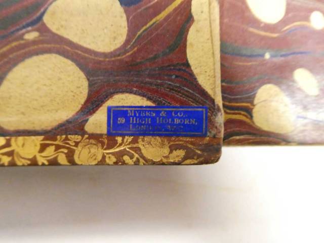
The bookseller’s ticket is stuck inside the lower front inside cover. Myers & Co, 59 High Holborn, London, can’t make out the rest from the photo

Barnaby_G

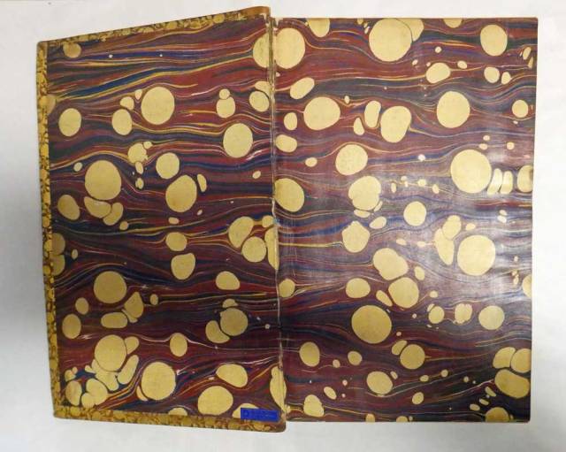
Inside front of book.

Barnaby_I

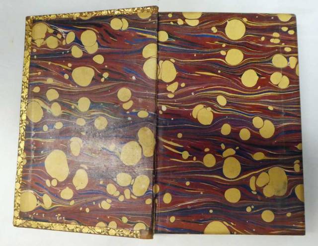
Inside back of book. Sorry, it’s upside down.

Barnaby_J

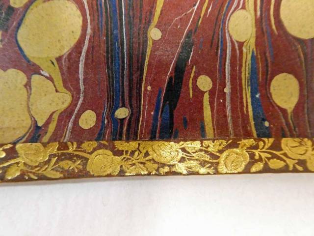
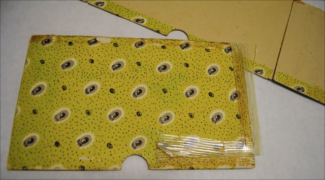
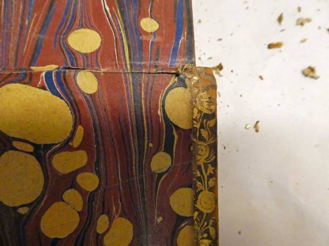
Lovely gold tooling on the inside leather turn-ins, done with gold leaf using a decorated roll tool.

Barnaby_K

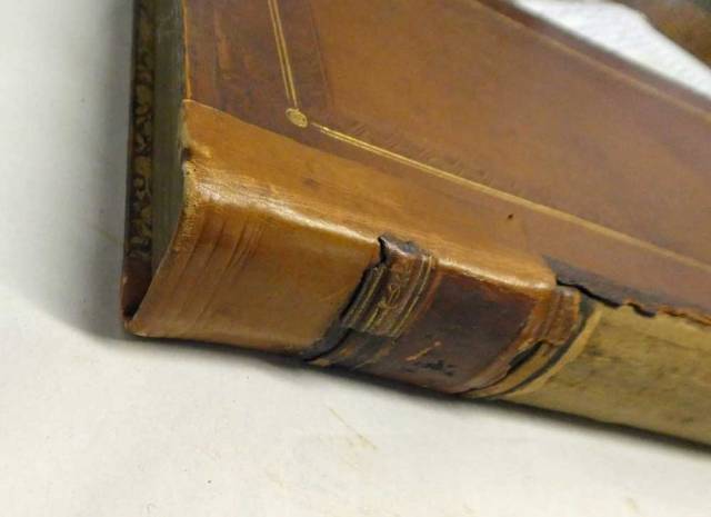
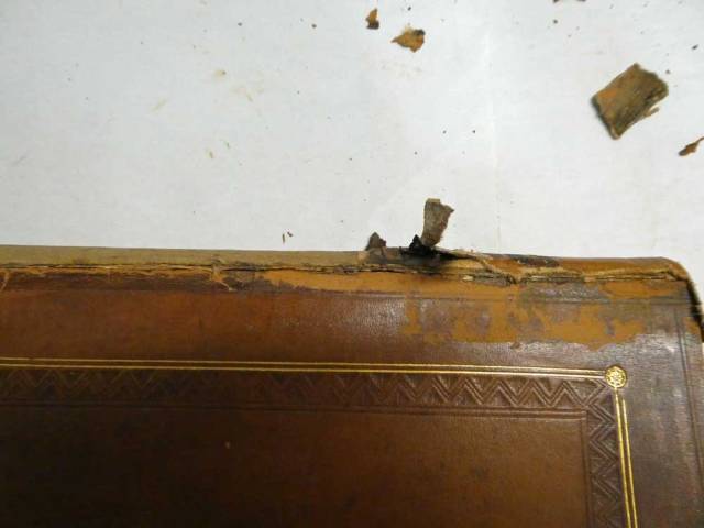
Corner shows some wear and loss of leather. Looks as if the finisher didn’t miter the corners, but just ran the roll off the end.

Barnaby_L

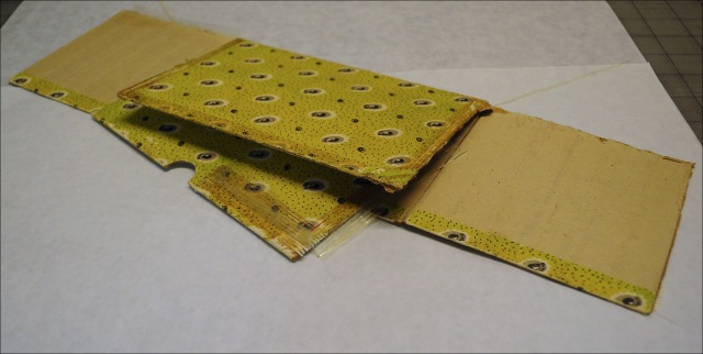
Inside back of book. See the plain leather folded over the decorated leather? That’s the repair leather, and it should have been tucked under the old leather, not glued on top of it.

Barnaby_M

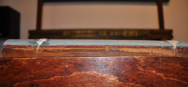
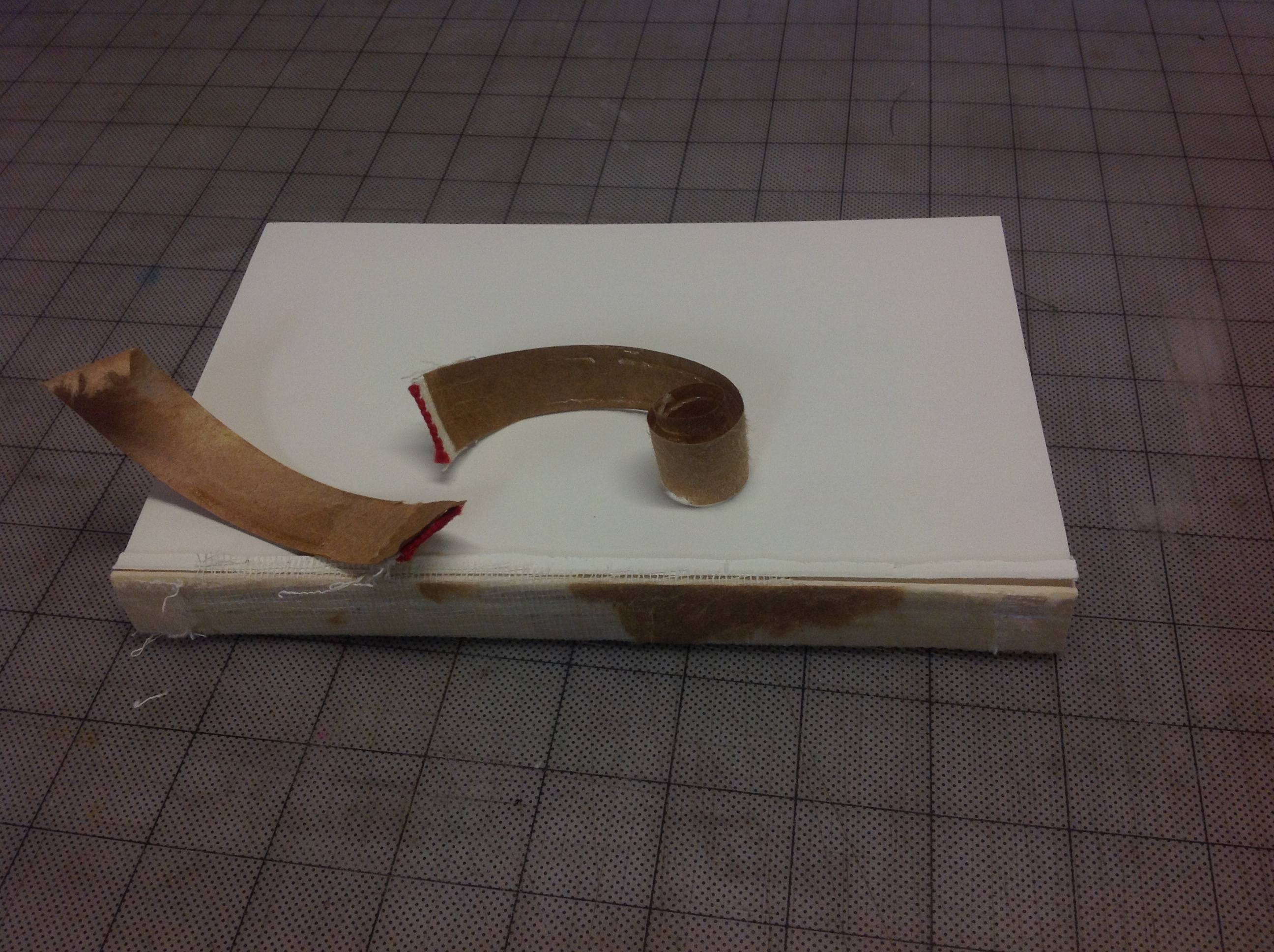
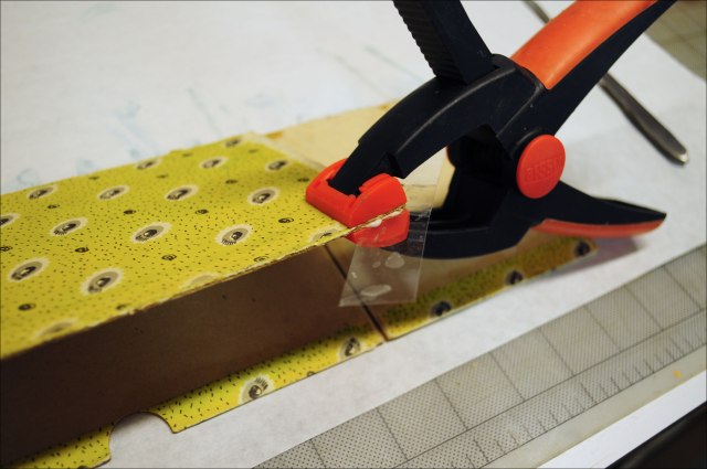
Here the repair is being lifted off the spine. I did not dare use any water to soften the adhesive, because I feared it would blacken the old leather, so I lifted it with a scalpel. You can see that the top layer of the old leather was pulled off in the process.

Barnaby_N

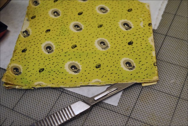
A zoomed-out photo of the process. Old leather is being slowly lifted off mechanically.

Barnaby_O

Interesting. As the old leather comes off, I can see what looks like some of the original spine – the leather piece on the false raised band is probably from the original spine, along with the cardboard underneath it.

Barnaby_Q

Here I am lifting the turned-on repair leather from the original leather. The old gold tooling, which was covered up, is starting to re-emerge.

Barnaby_H

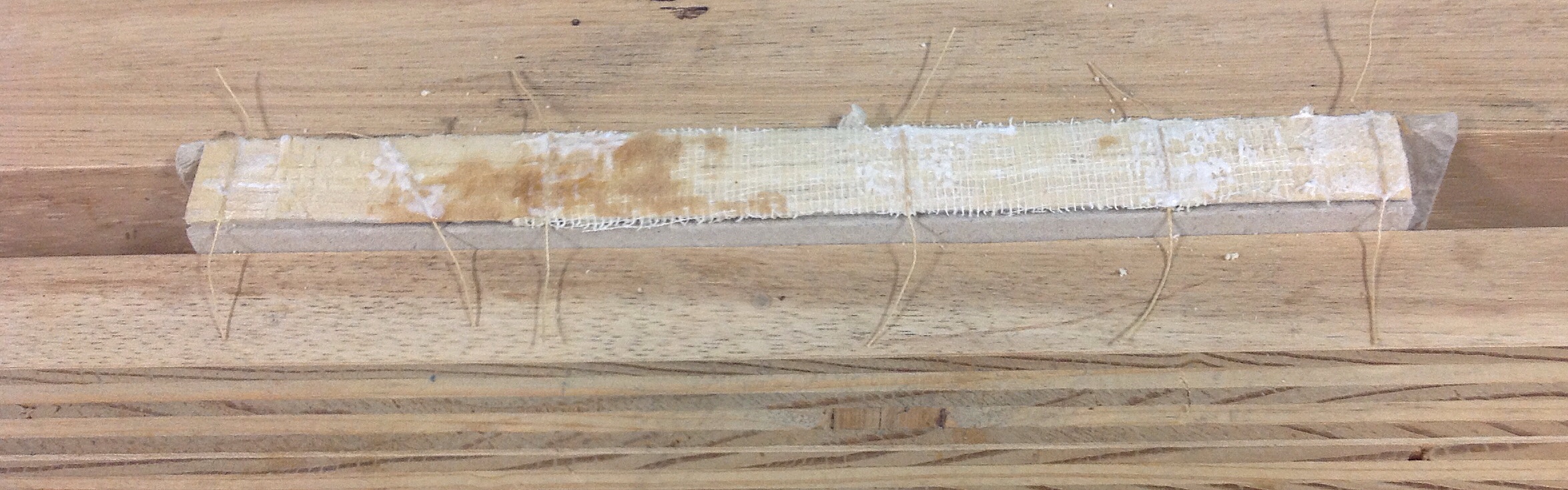
The book is now pared down to the original parts. The repair has been removed, and you can see the change in color of the spine, and the lighter leather on the cover where the top layer of calf was stripped off. Now I can begin the restoration.

Barnaby, Part 2

Before doing anything else, I decided to reinforce the board attachment. The boards were still attached by the original cords, but one was broken and one was loose. I laced some Irish linen cord through the original holes, top and bottom. Two of the old cords were strong enough that I felt comfortable knotting the new cord to the old, and two were weak enough that I laced the needle through the back of the spine. I adhered the new cords to the top of the new spine with PVA – it doesn’t cause the linen to swell the way paste does, and since it’s new to new material I don’t worry about reversibility.

I have a plan to fabricate the new spine in such a way that I can decorate it off the book, and do it over if I mess it up. More on that later.

Barnaby_12

Barnaby Rudge


Still looking for the before-before pictures. This is a work in progress: a friend’s nice old leather bound copy of Barnaby Rudge. Most of the spine was missing. All that remained was a bit of leather near the head that was not the original spine, but an older repair about half the height of the book. It was still attached to the outside top of the boards. The repair had false raised bands, and the it’s possible that the leather used to make them came from the original spine. You can see the lighter area on the cover leather where some of the patina was removed along with the repair. The repair was attached with paste, I think, and I didn’t want to risk blackening the original leather by moistening the paste, so I removed the material mechanically, and it took the top layer of cells off the leather. It’s not ideal, but it’s better than having the cover turn jet black. Some leather blackens when wet and the change is irreversible.


Barnaby_3-copy

I believe these small scraps are all that remain of the original spine. There was once some good tooling over the bands, and I will guess that the entire spine was decorated, since there is more than just a simple line below the raised band.


Barnaby_1-copy


This photo shows the edge gilding, which is on all three sides, as well as a bit of the gold tooling on the leather turn-ins. So much decoration on the insides really makes me think the spine must have been quite ornate.


DSC_0056-copy

The cover boards are still attached – barely – with the original lacing. I didn’t want to remove them. The marbled paper inside is broken at the joints, though, and needs repair. I hate to cover up that paper, so I dampened the edges of it enough gently lift a tiny bit of it off the boards on the inside. It turns out the original binder had made a bit of a wrinkle in the paper at the joint, and pasted it down over all the board edges, so I was able to tease quite a bit of it out. I colored a piece of Japanese tissue to match the dominant maroon color. The marble flyleaf was pasted to the first white endsheet for about a half an inch near the joint. I was able to also lift up the edge of this paper, attach the repair paper to the shoulder (and just barely on the first endsheet) and then paste the unfolded marble paper down on top of that. My hope is that once the book has been rebacked, there will be enough of the old marble paper left to nearly cover all the JT repair paper.


Barnaby_5-copy

This is a close-up of the inside front with a better view of the tooling of the turn-ins, and a booksellers ticket that reads “Myers & Co., 59 High Holborn, London” plus whatever is covered up by the folded up pastedown.  Sorry, the book is on another floor and I’m lazy. That’s the back side of the repair tissue. The idea is to eventually paste it down onto the bare board surface, then paste the colored paper back over the top.


Here are the first few pages of the book. No printing date. There is a pasted in newspaper clipping that seems old. I hope there’s enough information to identify the edition, and then perhaps I can locate an original copy and see if the decoration matches this one. That will give me an idea of what the original spine may have looked like. Whether or not I have the skill to tool a fancy spine is another matter.


Finished up with Alex & Me

Today I finished the cover and cased-in the text block. It’s not a true millimeter binding because there is more than one millimeter of leather showing on the sides. The spine is red leather, the main parts of the boards are covered in grey textured paper, and the corners are trimmed to expose the hidden vellum tips. These are small pieces of tough vellum and they stand up to wear better than paper or cloth. I used a silver foil for the title in keeping with the gray and red color scheme. This is the first time I’ve done this style of binding, and I did wind up with an imperfection – the inside pastedowns are wrinkled near the spine, possibly the fabric lining absorbed some moisture? Ah, live and learn.


Alex and Me

My current project is rebinding a copy of “Alex and Me”, by Dr. Irene Pepperberg. I’m  amazed by the groundbreaking work she did with Alex, the famous African grey parrot. Alex could identify – in spoken English – more than 100 objects and say what color they were, what shape, how many, what material, and whether an object was bigger or smaller than another one. He even had a concept of “nothing” or “zero”.  He was intelligent, with an outsize personality and a sense of humor. Dr. Pepperberg always referred to him as a colleague, and their achievements changed everything we know about animal cognition. Before Alex, scientists thought only a few primates  were capable of human-like thought, and that birds were at best imitators and mimics. Alex performed at the level of a five year old human child on many tests.

Sadly, Alex died in 2007. Dr. Pepperberg’s research is still ongoing, with two African greys named Griffin and Athena. Unbelievably at least to me is the fact that this research is entirely funded by The Alex Foundation, with no federal funding at all.  What kind of world is this? Everybody who works in the field of animal intelligence gives credit to Alex for opening an entire realm of possibilities. Together, Alex and Dr. Pepperberg helped changed how we think about how animals think, and inspired a new generation of researchers to continue exploring this incredible new world.

Here’s the work in progress. Remove dust jacket, cut cover off, remove stuck-on headbands and paper spine liner.


Removal of the cover revealed that this is not a sewn binding, but a perfect-bound (glued) book. I will have to recase it, using a few tricks to strengthen the binding.

First, I cut several shallow grooves into the spine, inlaid thin linen cords, applied more EVA, and lined with cambric.


While that was curing, I worked on the unpublished photo sent by Dr. Pepperberg to remove distracting elements and extend the right side of the image. I picked out a couple of quotes for the frontispiece, and printed the new pages on acid-free endpaper using archival inks. I chose heavy red paper for the pastedowns – to match the African grey tail feathers – and made up endsheetsets for front and back.


The new endsheets were sewn to the cambric spine lining, adhered with EVA, then hinged to the first and last pages of the textblock with Japanese paper guards. The cords laced through the spine were adhered to the outside of the pastedowns along with the cambric hinge. Then the text block was put in the press and the top colored to match the endsheets.

The Bibliomaniac’s Prayer and Mystery

bookplate001

I found this bookplate in a batch of old papers. I love it. It made me curious to know who this Herman Blum was, and if he  designed the plate himself, and if that is him in the photo. So I researched a little bit, and here’s what I found.

I believe this is Herman himself in the photo. I found a Herman Blum (b. 1885, d.1973) who was chairman of the board of Craftex Mills of Pennsylvania, a trustee of the Philadelphia College of Textiles and Science, a member of the Pennsylvania Historical and Museum Commission, a member of the US Civil War Centennial Commission, and “an avid collector of historical books and manuscripts.” I wish some of his books had accompanied the plate!

Harold wrote at least one book of his own: “The Loom Has A Brain: The Wonderful World of the Weaver’s Art”.

blum

The poem on the bookplate is excerpted from “The Bibliomaniac’s Prayer”. Only part of the poem is quoted, and some of the words were altered. I prefer the original language where the jealous others wail. And who is “Ohmnia”? There’s a Latin word, “omnia” which means “everything” but I could find no definition for “ohmnia” anywhere. It remains a mystery. 

Here is the original poem:

The Bibliomaniac’s Prayer

by Eugene Field

Keep me, I pray, in wisdom’s way,
That I may truths eternal seek;
I need protecting care to-day, –
My purse is light, my flesh is weak.
So banish from my erring heart
All baleful appetites and hints
Of Satan’s fascinating art,
Of first editions, and of prints.
Direct me in some godly walk
Which leads away from bookish strife,
That I with pious deed and talk
May extra-illustrate my life.

But if, O Lord, it pleaseth Thee
To keep me in temptation’s way,
I humbly ask that I may be
Most notably beset to-day;
Let my temptation be a book,
Which I shall purchase, hold, and keep,
Whereon, when other men shall look,
They’ll wail to know I got it cheap.
Oh, let it such a volume be
As in rare copperplates abounds,
Large paper, clean, and fair to see,
Uncut, unique, unknown to Lowndes.

The reference to Lowndes in the last line is to William T. Lowndes‘ “Bibliographer’s Manual of English Literature” catalog of rare and second-hand books.

The Taming of the Kwik-Print

After the modifications to my Force, I had no more trouble aligning materials for stamping. Stamping multiple lines of text was still a giant headache, though. My KP has a table than can be moved forward and back to permit multi-line titles, but there is no way to easily get the proper spacing. I tried inserting spacers between the back edge of the table and the iron upright post holding the printing head. I tried using a ruler to move the table out. But the upright iron is curved and uneven, and I hated the process. For years I’ve stared at that machine wondering what to do.

So yesterday I wandered back out to the Stash, put on my vinyl gloves, and dug out some likely candidates. I came back in with a couple of aluminum plates, some right angle brackets, a nice metal rod with two bearings, and a bracket from some old piece of electronic equipment. My idea was to attach something to the Kwik-Print base that would project out alongside  the table and give me a fixed point of reference, but I couldn’t figure it out. The K-P base was just too rough and irregular and whatever I put on it would be in the way. Then, eureka!

I glued the short wide part of my right angle bracket to the underside of the table. The long arm of the bracket stuck straight down, almost touching the cast iron base. There was just enough room for a metal rule between the end of this bracket and the base. I clamped it up and let it set overnight. The arm wasn’t dead vertical, but I figured this wouldn’t matter as long as I was consistent.

I laid out the text for a sample title using two dividers on card stock, drawing black lines at the top/base of each line of text. I affixed my blank label to the make-ready on the Force and taped everything down firmly. I placed my cartoon on the base, parallel to the table, and taped it down as well. I took a small Bridge City triangle and lined it up at the base of the first line, dialed the table back until I heard the tiniest click, the locked the table in place. This caused the table to rack slightly, so I adjusted it until it was right.

When I set up the first line of type, I realized that it was going to be too wide for the spine. I had to switch it out for a smaller font. And this was the first beautiful moment: since this was a smaller font, it was going to throw off the line spacing. I realized that I could simply align the type with the top of the line instead of the base. Since this was the bottom line of text, only the spacing above the line would matter. It took 30 seconds to reset the table position at the upper mark, lock it in place, and stamp. Then I worked my way up, aligning the triangle and holding it firmly in place as I moved and locked the table for each line.

The second line of the title was supposed to be an actual line, but the brass strip I use for these turned out to be too thin in cross section, and I wasn’t able to clamp it into the type holder. It kept slipping under the jaws. So I went ahead and stamped the rest of the label. When I reached the top line, I had another problem. I had originally laid out the title by drawing and marking with dividers from the base of each line. But since I had to change and align at the top edge – to accommodate the smaller type – I could not place the top line. Lucky for me I had kept my dividers set at the correct gap after drawing my guide cartoon, so I moved the table way forward, marked and drew in the new guideline, then cranked it back as before to stamp in exactly the right place. Then I picked out a large capital I and turned it sideways to make the short dash. Set up the triangle, clicked the table to it, and stamped it between the bottom two lines. Perfect.

It would have taken me much longer to set the lines using my old spacer or ruler method. And there’s no way I could have made all those adjustments on the fly, or gone back and inserted a line of text. I’m totally stoked about this little modification.

I think I could improve it by getting a small magnetic block to use in place of the triangle. I might also attach a thin, straight angle bar along the edge of the K-P base since it’s not perfectly straight and flat. That would also let me along my block or triangle so it’s square to the direction of travel. I see no need to straighten out the slight bend in the table’s bar – as long as it just touches the triangle it doesn’t matter.

Now I can not only take the material off the press and restamp it thanks to the Force, I can go back to the correct line placement. I wouldn’t use that method to add letters to a line, though it would be better than trying to eyeball it.

If you already have a nice hot stamping machine with a reference bar, you might not need to kludge anything together like this. But if not, this one small mod will make your stamping life easier.


The triangle in place on the cartoon.


The table adjusted so the bar just barely clicks against the triangle.

The Force Reawakens

Do you have difficulties in the hot stamping department? Well, there’s no need to be ashamed. I used to suffer from erratic stamping errors myself, but that was before the ever helpful Book Arts mailing list told me a secret. Have you heard of “The Force”? It’s an epic jig for the hot stamping machine, from the seething brain of Bill Minter. I found his instructions online and built one. After that, anything I stamped could be removed from the press, and when put back in place could be re-stamped perfectly every time.  Still, life wasn’t perfect. I found that I was spending an inordinate amount of time on the setup phase – partly because the alignment guides I drew on the paper under the protective Mylar, were not exact enough. Also the Mylar I used to protect the paper warps over time and does not hold the materials firmly enough in place.

I sent a copy of Bill’s excellent Force adventure instructions to J.T. , a fellow sufferer. He built his own, making some genius modifications of his own. This inspired me to face my own Force. I removed the Mylar and paper taped to the surface. Then I placed the bare metal Force – mine uses a large flat piece of aluminum plate which was lying around (I know, lucky me, right?) back on the table. I clamped an old blade from a Tandy leather knife in the center of the type holder, lowered it to the Force, and cranked the table all the way in the other direction. The blade left a clean thin line engraved into the metal. (In case it isn’t clear, I stole this idea from J. T.)

I extended this line all the way across the plate using a sharp tool, then darkened it. I tried rubbing on ink and graphite to see if I could stain the line and wipe the residue from the surface, but finally resorted to strengthening the line by hand with a fine point pen. With a triangle and rule, I made additional lines, in pencil, perpendicular and parallel to this line. I laid a half-inch brass rectangle along the top edge, butted a plexiglass plate up to it and taped it down.

When I get a larger piece of plastic, I’ll cover the entire plate, but for now this small modification makes it simple to set up materials for stamping and get a perfectly aligned result.

Lines drawn, plexi taped in place.
Kwik-Print with bare table, fitted with backstops
Kwik-Print with Force

Slipcase Repair

This poor thing belongs to a friend. I want to see if I can repair it. As  you can see, it has been “repaired” previously with strapping tape. Strapping tape is evil.

Slipcase_1Slipcase_2Slipcase_3Slipcase_4

The plastic layer of tape lifted off easily, as did the reinforcing fiber bundles. The adhesive had soaked into the paper, though, and left it stained and sticky.

Slipcase_5.jpg

Copious amounts of acetone, to my surprise, removed most of the adhesive and stain. Removal of the dark stain revealed a few losses to the cover paper along the edges.

Slipcase_6Slipcase_7Slipcase_8


I matched the cleaned slipcase pieces against some Japanese tissue to find the best color match. The first was too dark, the second a bit too green.I tinted the greener of the papers with dilute yellow oxide acrylic paint. 

Before going any further, I flattened out one bent, delaminating corner.

Slipcase_12

Scalpel time. The printed cover paper must be lifted up from the board, so that a strip of the tinted Japanese tissue can be inserted below it. This way, the repair paper doesn’t cover up any of the decorated paper on top.

Slipcase_13Slipcase_14

I glued the sides back together to re-form the slipcase, using the Japanese tissue to connect the different pieces together. Again, the repair paper went under the decorated paper. I was able to remove a hidden strip of the original cover paper from under the top layer, and use fragments of it to fill in missing pieces.

This seemed like a good time to also apply reinforcing Japanese paper to the inner joints. This time I had a heavy paper that was a good color match, so I didn’t need to tint it.

Slipcase_17

Next I mixed up some heavy acrylic paint to match the cover. The color of the cover actually varies, with some greener areas and some more yellow areas, so I went for a color that would harmonize with both. I colored all the exposed repair paper, which adds strength, as well as the larger worn/missing areas. A few white and gray areas also needed inpainting. Once that dried, I added dots and missing details with permanent black ink.

Slipcase_18Slipcase_19Slipcase_20

Once all had cured for a bit, I applied a microcrystalline wax to the outside surface to protect the fragile paper from friction wear. The wax also helps the repair tissue to blend in with the original materials.  And here it is.

I left the images fairly large, so if you are curious  you can inspect the work in detail and find all the imperfections. Hey, they don’t call it “practicing a craft” for nothing. A whole lot of practice is still to come before I can begin to think of mastery of the craft. And if it’s all as much fun as this, I’ll never work a day in my life.