
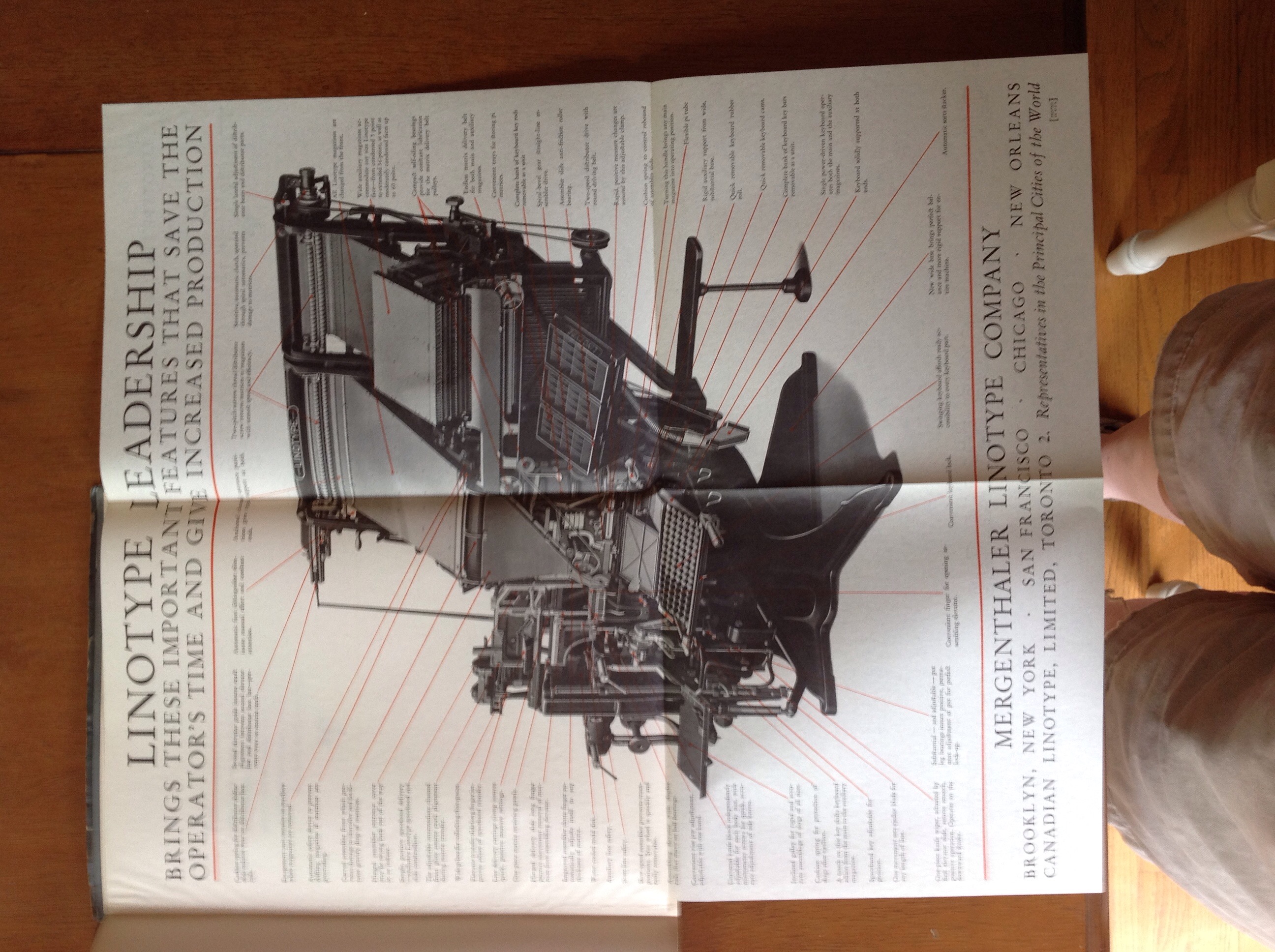
Linotype Leadership, 1930, Mergenthaler Linotype Company of Brooklyn, New York
“Since the first Linotype cast the first slug, the Linotype organization has never ceased development work on the Linotype. Everything that has been learned in almost half a century’s experience in machine composition throughout the entire world is in the Linotype. No problem is evaded. Its makers never had to compromise. It contains no makeshifts. Nothing is omitted from the Linotype.” Beautiful font with delicate serifs joining s and t when they occur, why? Like the Linotype, I find that my own half century’s experience has become largely irrelevant. If only I had documented the details in such fine grain as this book, which explains – with pictures and diagrams – everything from “Mold Disk Locking Stud Block” to “Automatic Font Distinguisher” , the latter “relieves the operator of unnecessary attention to manual or mechanical details.” How I long for such relief! Alas, the Linotype is no more, and so the former operators are now relieved of all required attentions.
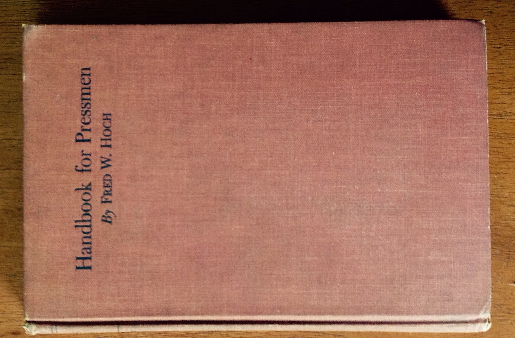
Handbook for Pressmen, 1950, Fred W. Hoch
I like the good paper this book is printed on, and the reinforcing mull visible under the pastedowns, which do show some slight discoloration from age. A random quote: “No book yet published is more comprehensive than (this one)” and maybe it’s true. Sample chapters: Two Colors On A One Color Press – Slurs, Their Cause And Remedy – Repairing Plate Batters – and most succinctly, Ink. There is a black and white illustration of a color chart and of a double trim remedy for fuzz, among 26 other beauties. Reading this book is a wonderful immersion in the mind of the mid-century printer’s daily work.

Thirteenth Annual Printing Trades Blue Book, Western-Southern Edition, 1935
Don’t you want to see what’s on the back cover? Sure you do. You would learn that SPIRAL BINDING has proven itself a worthy companion of the Printing and Allied Trades, and more. The book itself is charming, with crisp notches for easily finding a binder near you, provided you live someplace western or southern. This would actually be a good reference for information about individual binders/printer/suppliers. The Graphic Arts Publishing Company says “You cannot invest $5 better” than in their Encylopedia of Printing. Personally, if I could go back to 1935 and invest $5 in the stock of my choice, I wouldn’t be sitting here typing all this myself. I’d be lolling about on the divan dictation the text to Johann and scarfing bonbons. Maybe it’s best that I don’t have a time machine after all because I wouldn’t use it for good. This charming book has a hollow spine, striped endbands, and includes a sample page printed on Buckeye Cover, because what ever others may say, experienced printers and advertising men know that Buckeye Cover is the most beautiful, the most enduring and the most famous of cover papers. Want to buy some? In 1935, this book tells you where. You just need that time machine …
Charles Holtzapfel’s Printing Apparatus for the Use Of Amateurs, 1971, reprinted by photo-litho from the third greatly enlarged edition of 1846, Private Libraries Association in Great Britain. So the cover is only slightly worn cloth, the pages are thick bright modern paper, the introductory section on the history of printing is new, but the original text and illustrations are old-time quality. My favorite parts are the illustrations of different fonts, including No. 31 Dublin which has letters made of stone blocks, the examples of different stylish borders and lines, coats of arms, bees, and tiny engravings of a steam locomotive, a steamship with sails, and a crown with big fluffy plumes of feathers over a banner that reads “ICH DIEN” which I think means “I SERVE”. I suppose it’s another good historical reference, especially if you need to identify stone typefaces, but I’m nuts about the feathery crown.
