Some books about actual art in bookbinding


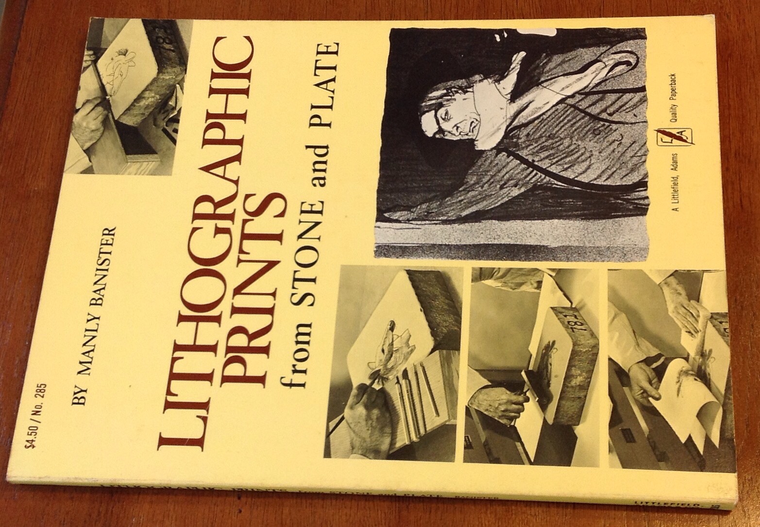
Lithographic Prints from Stone and Plate by Manly Banister, 1974.

Paperback, good condition. For the rank beginner at lithography, telling you everything you need to know except for where to get the darn litho stones. I’ve been looking for years for a larger stone. Lots and lots of detail and photographs showing every step including how to flatten a stone, how to build the wood stand, arrange the print shop, I mean everything. I don’t dare read any further or I’ll be tempted to take up the art, and we’ve already established that I don’t have the stones for it.

 
The Encyclopedia of Lithography by Miles, 1938. Brown cloth hardcover with an owner’s name inscribed in pencil inside. Otherwise clean and tight. A most encyclopedic work and perhaps you will be entertained by some excerpts. I am. “No other graphic industry for instance has presses that will use completely planographic plates, that use water fountains, that use an offsetting cylinder or that use a stone as the reproducing medium. Neither do other graphic processes use a colloidal phenomena to achieve their printing plates.” Well, duh. Long reprint of a technical paper The Theory of Three Color Reproduction with way more graphs, charts and equations than you the artist probably want, and all in glorious black and white. What’s wrong with this picture? Redeems itself with wonderful entry under Letter Construction which includes ” … The H goes to the uttermost extremes a letter can occupy in space, and every letter with which it is associated with must conform to it in size or the area it occupies in order to get uniformity of quantity. Even the W and the M have to be whipped into line if the Orthodox idea of excellence is the criteria, though both of these letters are much wider than the H.” Such stern threats against poor W and M. Is this why they have to stand on the doors of public toilets everywhere? are they being punished for some sort of insubordinate width?

  
A Collection of Interesting And Historic Prints, 1909, State Street Trust Company. Being a single section paper covered book of …. Here, let them explain it: “The State Street Trust Company takes this means of presenting to you its compliments. It hopes this booklet of historic prints will be of interest to you. All of the reproductions are taken from copies or originals in the possession of this company, which are to be seen at its main office, 38 State Street. Many of them to depict some interesting phase of Boston’s history. Please consider this booklet also as an invitation for you to inspect the prints from which these reproductions have been made.” I think they are just trying to get you into the bank so they can talk you into opening a Christmas club account. If you go, check and see if all the pictures are still there. I bet some of them have been smuggled home over the years along with other office supplies.  It is a nice collection of historical prints.  I’m particularly fond of one described thusly:  celebration incident to the introduction of Cochituate water into Boston in 1848, and first exhibition play of the fountain in the frog pond on the Common. In left foreground, with a dog behind him, is Daniel Webster.” It’s quite the gathering of the masses. I didn’t see any port-o-lets in the etching … Perhaps some advantages accrue to wearers of hoop skirts, after all. 

  
Prints And Books, Ivins, 1926. Cloth spine over paper hardcover, Newberry Library bookplate in front, not stamped discarded so there may be some overdue fines. A little dirty, front joint is contemplating  loosening up, but good condition. May I quote? “The following …papers were written because the writer, in the course of his work, became so enthusiastic about certain things that he wanted other people to be interested in them, too.” Written for the regular non scientific reader who would like to learn about prints and books and maybe look at some nice illustrations. Utterly fascinating, srsly.

  
The Illustration of Books, by David Bland, 1951. Pretty yellow cloth hardcover with dust jacket. A history of book illustrations with black and white and color images, discussion of processes and techniques. I just read the section on William Morris, and I can only sigh with delight. A wonderful book.

Some books about printing and the printers what printed them


Pioneer Printer- Samuel Bangs in Mexico and Texas by Lota M. Spell, university of Texas Press, 1963

Former library book with dust jacket and owner/donor’s bookplate. Stamped withdrawn from Wellesley Free Library in Mass. I guess they don’t care about Texas printers in Massachusetts anymore. An “insight into the life of Samuel Bangs, the man who printed or help to print the first document known to have issued in that form in Texas”. I think he deserves to be remembered just for dragging a printing press to Texas in 1819. I have been hoping to come across the biography of a successful and wealthy early printer, but this is not that book. This is a detailed historical narrative and just as interesting to fans of Texas is it is to fans of early pioneer printers.


The Story of The McGuffeys, by Alice Ruggles, 1950. Tan cloth, red/yellow endbands, nice clean binding with bonus material in the back! Remember Emmett Horine from the last post? Glued in the back is the original invoice from the American Book Company with Emmett’s name spelled every which way wrong, along with a letter, which is a folded flyer? advert? order form mailed to him postmarked Cambridge, Mass with a two cent stamp, on which is handwritten “From Mrs. Ruggles”.


This is a memoir written by a granddaughter of the author of the great McGuffey readers. I love these old readers, with their big words and real stories – so much better than the Dick and Jane books of my old school.   As the author says, “tastes were nearly pampered nor stinted. Madness, torture, and death were considered suitable subjects for older children, if expressed with force or beauty. So they had “The Maniac,” “The Crazy Engineer,” “Conflagration of an Amphitheatre,” and the horrific scene between Hubert and Little Prince Arthur in “King John.” But they were luckier than the modern child. The reading of the horrors stimulated the imagination but left it free to work. The child who sits before a moving picture has all his imagining done for him.” Yeah, that seems about right.


Printing In The Americas, Oswald, 1937. Cloth hardcover. Inside is written “Store Copy” in pencil with a small purple sticker or bookbinder’s ticket from Bertrand Smith’s Acres Of Books in Cincinnati. A nice copy of a most exact history of printing in the Americas with illustrations. Just like in the USA Today, you can look up the first known printers in your own state! For myself, I wish there were still an Acres Of Books to visit, except that I would probably wind up buying more books and you see what kind of trouble that gets me into.


Printing in Delaware 1761 – 1800, by Eval Rink,  1969. Nice blue cloth hardcover with blue and yellow endbands and small tear to dust jacket. Not so much a narrative but a list of various printers in Delaware for the years mentioned. Let’s pick something at random. “127. Wade, Francis. Advertisement. To the inhabitants of the Delaware State [concerning horse thieves, deserters, and George Evans’ illegal sale of public flour. ..]” ah, The good men do goes with them to their graves, the illegal sale of public flour is remembered forever.


Early American Books and Printing, by Winterich, 1935. Good red cloth hardcover, damaged dust jacket. Name and date inscribed on fly leaf, otherwise clean. The author states that the work should be considered not so much as a definitive reference as a guide to sources. Would really distinguishes this work is the wonderful writing style of the author, such as this description of a group of books including five copies do the Bay Psalm book: “Prince willed his collection to Old South, and it remained in the steeple for a century, accumulating dust, prestige, and value. ”


William Caxton & His Work by Winship, Book Arts Club, University of California Berkeley 1937.  Pretty turquoise cloth hardcover with dust jacket, one of the 525 copies printed on Wayside Text paper. It contains a preface by the author, a preface to a letter from the author about his Caxton paper, the 1937 letter itself, addressed to the Book Arts Club, followed by the 1908 Caxton paper itself. Again, let’s enjoy a quotation. “La Tour Landry composed his book ‘for the enseygnement and techyng of his doughters’…’which boke is comen to my hands by the request and desire of a noble lady which hath brought forth many noble and fair doughters which ben vertuoysly nourished and lerned.’ ”


Dr. Johnson’s Printer – The Life of William Strahan by J.A. Cochrane, 1964. Nice pink cloth hardcover with dust jacket, very clean. I’ll just quote the blurb: ” William Strahan was one of the leading figures in the booktrade of the 18th century. As Kings printer, a member of Parliament and the owner of the greatest printing house in London he stood at the head of his craft: in addition to his long friendship and business connection with Johnson, he was the publisher of given Adam Smith human and Robertson. His intimacy with Benjamin Franklin Led him to extend to America his lively interest in politics as well as trade… Strahan was an admirable letter writer, and his correspondence with authors, booksellers and printers touches on many problems still relevant today – the earnings of writers, best sellers and flops, price cutting and piracy, long credit and bad debts. The book is thus a portrait of the booktrade at a particularly interesting stage of its development as well as the story of a remarkable career.” It’s true – Strahan’s letters are a window onto a fascinating era.


Some Books about Bookbinding: Printing Equipment

From Xylographs to Lead Molds AD 1440 – AD 1921, printed in … wait for it … 1921 in a limited edition by the Rapid Electrotype Co. A business card, perhaps the original owner, in front. Lovely red and black chapter headings. Some pencil writing on spine reads “Type Founding” and I believe the cover is blue paper.


I’ll allow the photos to speak for themselves …

Dr. Church’s “Hoax”, An Assessment Of Dr. William Church’s Typographical Inventions in which is enunciated Church’s Law, by Richard Huss, 1976. Blue cloth with dust jacket with striped endbands. Somehow I don’t want to spoil the mystery by revealing too much about this book about the invention of the first typesetting machine and the aforementioned Law. Let’s just say good paper bright and clean pages. It’s not so much a book about the history of the machine as about the life of Dr. Church and all the things invented by this ingenious guy born in Vermont in 1779. This is a love song to someone who might otherwise have fallen through the cracks of history’s floorboards and become lost in the dust of time.


The Iron Hand press in America by Ralph Green, 1948. This is a modern single section binding done in paper over board. On the back fly leaf is inscribed:

This is a 3M copy

Of a Xerox copy

From the U.of.K Library

Given to Emmett Horine 1969

– BL

Who is BL? He or she did a nice job hand binding this small reproduction of an old book.


Some books about printing: References for the Trade


Linotype Leadership, 1930, Mergenthaler Linotype Company of Brooklyn, New York

“Since the first Linotype cast the first slug, the Linotype organization has never ceased development work on the Linotype. Everything that has been learned in almost half a century’s experience in machine composition throughout the entire world is in the Linotype. No problem is evaded. Its makers never had to compromise. It contains no makeshifts. Nothing is omitted from the Linotype.” Beautiful font with delicate serifs joining s and t when they occur, why? Like the Linotype, I find that my own half century’s experience has become largely irrelevant. If only I had documented the details in such fine grain as this book, which explains – with pictures and diagrams – everything from “Mold Disk Locking Stud Block” to “Automatic Font Distinguisher” , the latter “relieves the operator of unnecessary attention to manual or mechanical details.” How I long for such relief! Alas, the Linotype is no more, and so the former operators are now relieved of all required attentions.


Handbook for Pressmen, 1950, Fred W. Hoch

I like the good paper this book is printed on, and the reinforcing mull visible under the pastedowns, which do show some slight discoloration from age. A random quote: “No book yet published is more comprehensive than (this one)” and maybe it’s true. Sample chapters: Two Colors On A One Color Press – Slurs, Their Cause And Remedy – Repairing Plate Batters – and most succinctly, Ink. There is a black and white illustration of a color chart and of a double trim remedy for fuzz, among 26 other beauties. Reading this book is a wonderful immersion in the mind of the mid-century printer’s daily work.


Thirteenth Annual Printing Trades Blue Book, Western-Southern Edition, 1935

Don’t you want to see what’s on the back cover? Sure you do. You would learn that SPIRAL BINDING has proven itself a worthy companion of the Printing and Allied Trades, and more. The book itself is charming, with crisp notches for easily finding a binder near you, provided you live someplace western or southern. This would actually be a good reference for information about individual binders/printer/suppliers. The Graphic Arts Publishing Company says “You cannot invest $5 better” than in their Encylopedia of Printing. Personally, if I could go back to 1935 and invest $5 in the stock of my choice, I wouldn’t be sitting here typing all this myself. I’d be lolling about on the divan dictation the text to Johann and scarfing bonbons. Maybe it’s best that I don’t have a time machine after all because I wouldn’t use it for good. This charming book has a hollow spine, striped endbands, and includes a sample page printed on Buckeye Cover, because what ever others may say, experienced printers and advertising men know that Buckeye Cover is the most beautiful, the most enduring and the most famous of cover papers. Want to buy some? In 1935, this book tells you where. You just need that time machine …


Charles Holtzapfel’s Printing Apparatus for the Use Of Amateurs, 1971, reprinted by photo-litho from the third greatly enlarged edition of 1846, Private Libraries Association in Great Britain. So the cover is only slightly worn cloth, the pages are thick bright modern paper, the introductory section on the history of printing is new, but the original text and illustrations are old-time quality. My favorite parts are the illustrations of different fonts, including No. 31 Dublin which has letters made of stone blocks, the examples of different stylish borders and lines, coats of arms, bees, and tiny engravings of a steam locomotive, a steamship with sails, and a crown with big fluffy plumes of feathers over a banner that reads “ICH DIEN” which I think means “I SERVE”. I suppose it’s another good historical reference, especially if you need to identify stone typefaces, but I’m nuts about the feathery crown.

Cobbler’s Child Shod!

K_D_Metschuleit_1AI finally made a book for myself! The backlog in the bindery is so great that I haven’t felt able to take time for my own work. And that’s wrong. The whole reason I began bookbinding was because I loved beautiful leather bound books.

Digression: the first sentence I learned in Chinese class was “I don’t buy books. Books are too expensive.” I do buy books – lots of books – but fine leather books ARE expensive. My masterful plan was to learn bookbinding as a second career, and as a sneaky way to fill my library with fine, fine books. Who knew it would take so much time to learn bookbinding, set up a business and be bookbinder / janitor / receptionist / accountant / website developer / marketer … Guess what I haven’t made time to do?

This is a copy of Small Kingdoms by my dear friend Anastasia Hobbet. I’ve had the unbound signatures sitting on a shelf for years. A piece of metal door screen – found amidst the debris decorating the riverbanks after a big flood liberated some trailers from a campground upstream – was the inspiration for this binding. I pulled it from the flotsam, admired the old-school pattern of the heavy aluminum, and knew immediately that it belonged on this book.

Small Kingdoms is a book about the myriad hidden worlds of Kuwait. I met Anastasia in Kuwait back in 1996, lucky lucky me … and there I glimpsed some of these small worlds myself.  Women’s faces were hidden behind veils, behind walls, behind screens.  Pierced screens allowed the women to look down into gatherings of men that they were not permitted to join. Atop the layers of physical screens were the invisible barriers of language and culture – I simply could not see into that world. In a restroom at the opulent Sultan Center grocery store, I washed my hands at one of the sinks and turned to see a handful of paper towels, held out to me by a woman covered from head to foot in black silk. Billowing black abaya … heavy silk head scarf … thin black silk over the nose and mouth. Only her eyes were exposed: dark eyes lined with black, thick black lashes. She held out the towels to me without a word, and I took them from her without taking my eyes from hers. I thanked her, dried my hands, and we stood there looking at one another. She didn’t say a word …. she kept standing there … she kept looking into my eyes. It was, and is, a complete mystery to me.

While many Kuwaiti men spoke english, having attended school abroad, many women did not – they were not allowed such education – and I think she didn’t speak my language, and I didn’t speak much of hers. The Gulf War was still recent memory and many Kuwaitis were extravagantly grateful to the US for helping to deliver their nation out of Saddam’s grasp.Was this her way of saying thank you? Or was she simply taking advantage of a private moment to inspect one of the strange western women who ran about unveiled? Was she looking to see what my world was like? Was she trying to tell me something about hers? It was a brief glimpse, an opening of the veil, a rare and intimate connection. I felt both dumb and blind. Here was a person right in front of me, and I could see her perfectly, but I could not see her at all. I felt deeply connected to her, but I understood nothing she was telling me. I finally turned and left because I didn’t know what else to do, and the memory haunts me still. Why didn’t I try to talk? Why didn’t I look for someone to translate? Wave my hands around? Did she need something from me that I didn’t give? Kuwait was not a place that I could understand, and this moment showed me that it was not even a place that I could even truly see.

Years later, standing in the mud of the Big Flood, holding up the twisted square of trailer door screen, that moment came back to me. I knew that I would somehow bind a copy of Small Kingdoms with this screen. I knew already that I wanted the book to reveal itself gradually from within obscuring layers, but I hadn’t had any vision of what that might be. When I saw the screen, I knew I could use it in the binding to give just a glimpse of the book within.

The binding is in teal Siegel goat leather, with an inlay of black and painted white leathers. The woman’s head contained within the outline of the map of Kuwait was inspired by the dust jacket from the commercially printed version. The map shows the scars and ash of war. The spine label is a heart, in honor of the deep affection between Anastasia and myself, and for the love that leads us to see other humans through the screens of culture and language. The hand shows that it is only – only – through some action of the hand, be it opening a door, reaching for another hand, holding out a paper towel, writing … that we make this affection manifest. It is traced from my own hand, because this is where I begin. The screen was a challenge. I didn’t want it to touch the book, so it’s lined inside with Mylar, and it’s hard to glue Mylar to metal. I used Loctite plastic glue, then sewed the  layers together with linen bookbinding thread before encasing the edges in frames of Davey board covered in Asahi Japanese bookcloth. Within the outer shell is a close-fitting cradle that holds the book securely. An additional piece of board on the back helps support the book upright on the shelf. The whole thing is slightly imperfect: the screen doesn’t stay flat, the top and bottom of the case aren’t rigidly square… and I like it that way.

I violated many habits in making this book. I violated my habit of needing everything to be perfect. I violated my habit of hoarding beautiful materials for more “worthy” projects. I violated my habit of guessing at what someone else would approve of.  I violated my habit of doing things for others before doing something for myself. I made this book, I made it for me, I made it the way I wanted, I used my favorite colors and only put into it things I loved, including love. I hope other people think it’s beautiful too, and I hope that you all go buy a copy of Small Kingdoms  to see the beauty that is the reason for the binding: the book itself.

Here’s a link, even: Small Kingdoms